




AUTO POSTO RENOVATION · COROMANDEL/MG
RODARE

OVERVIEW
Auto Posto Rodare renovation, located in Coromandel, Minas Gerais. Since the gas station had been shut down, the owners were looking for a complete revitalization, but with controlled investment. Given this scenario, we developed a strategic visual project that combined low cost and strong impact. To do this, we used affordable materials and functional solutions, ensuring both practicality and aesthetics. In addition, we readapted the main signage points — such as the canopy fascia, the price sign, and the store facade — always prioritizing visibility and harmony among the elements. We also selected a strong, trustworthy color palette, designed to attract drivers' attention and convey modernity. As a result, we were able to transform the space into a renewed, organized, and visually competitive environment. This way, Auto Posto Rodare received a new brand identity and is ready to reposition itself in the local market with a solid, striking image.
Services
| BRAND IDENTITY | 3D MOCKUP |
| LOGO DESIGN | 3D PROJECT |
LOGO DESIGN
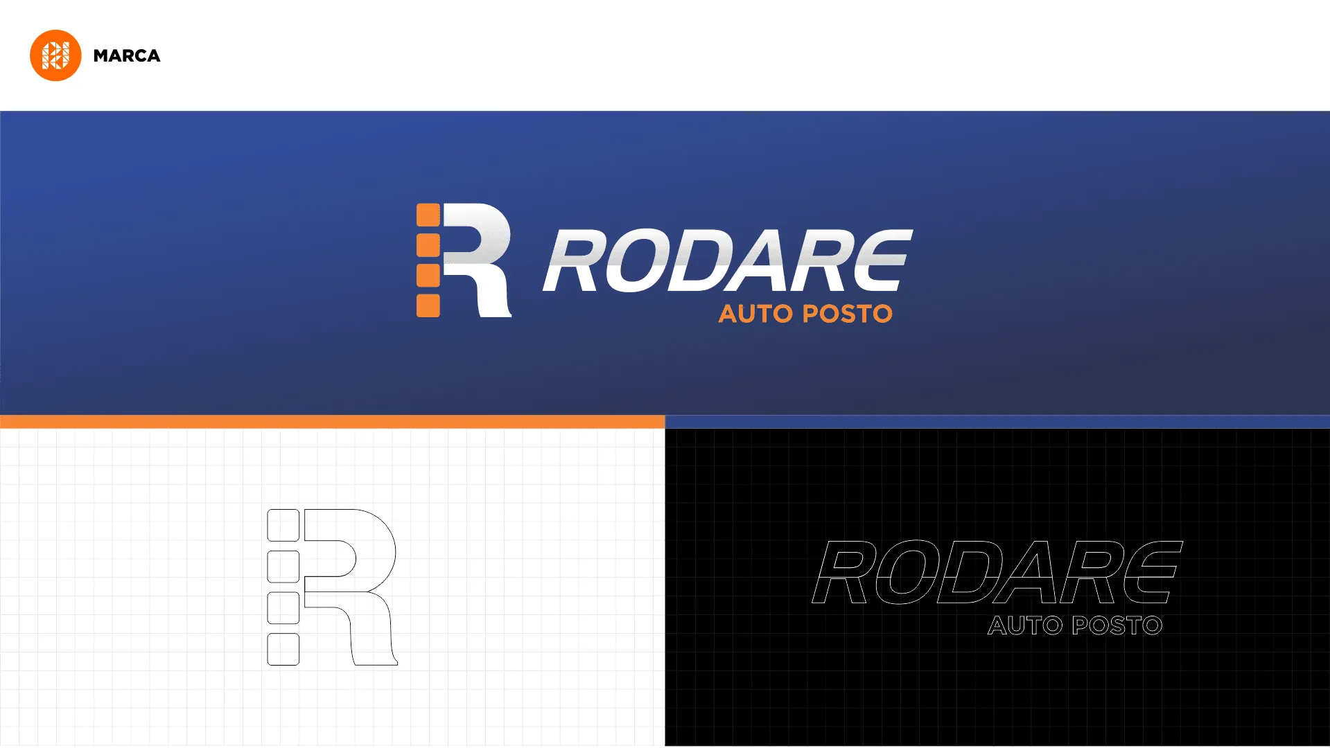
We created the new Auto Posto Rodare brand with a focus on simplicity, visual impact, and easy recognition. To do this, we developed an exclusive symbol from the initial letter “R,” which gave the brand identity and personality. This symbol was carefully designed to adapt perfectly to the different signage elements, such as canopy fascias, price signs, and uniforms, thus ensuring effective, coherent standardization. In addition, we applied the colors the owners had previously wanted, respecting their preferences and aligning the new identity with the gas station's commercial proposal. As a visual strategy, we chose to use white as the dominant color. This choice was made precisely because, when lit, white provides greater prominence, increases legibility, and enhances the brand's presence, especially at night. This way, we were able to ensure that Auto Posto Rodare stood out both day and night, reinforcing its new phase with a modern, striking, and appealing image.
3D BRAND IDENTITY
The convenience store, for example, was quite run down and therefore underwent a complete revitalization, including new paint and an ACM facade, which brought a more modern, clean look to the space. For the canopy fascia, we designed a model with simple, straight shapes, since it would be executed entirely in vinyl banner, which called for practicality and good use of the material. In addition, we reworked the column cladding in a simplified way, ensuring good visual presentation without raising construction costs. Finally, we developed pump toppers with a basic but functional layout, valuing clarity of information and easy understanding for customers. This way, even with a controlled investment, we were able to deliver efficient, harmonious signage fully aligned with Auto Posto Rodare's new identity, contributing to its reopening with a renewed, more competitive image, with a gas station design and brand identity.
Related Works

Pontual gas station design
