GAS STATION VISUAL
ON PETRO NETWORK
OVERVIEW
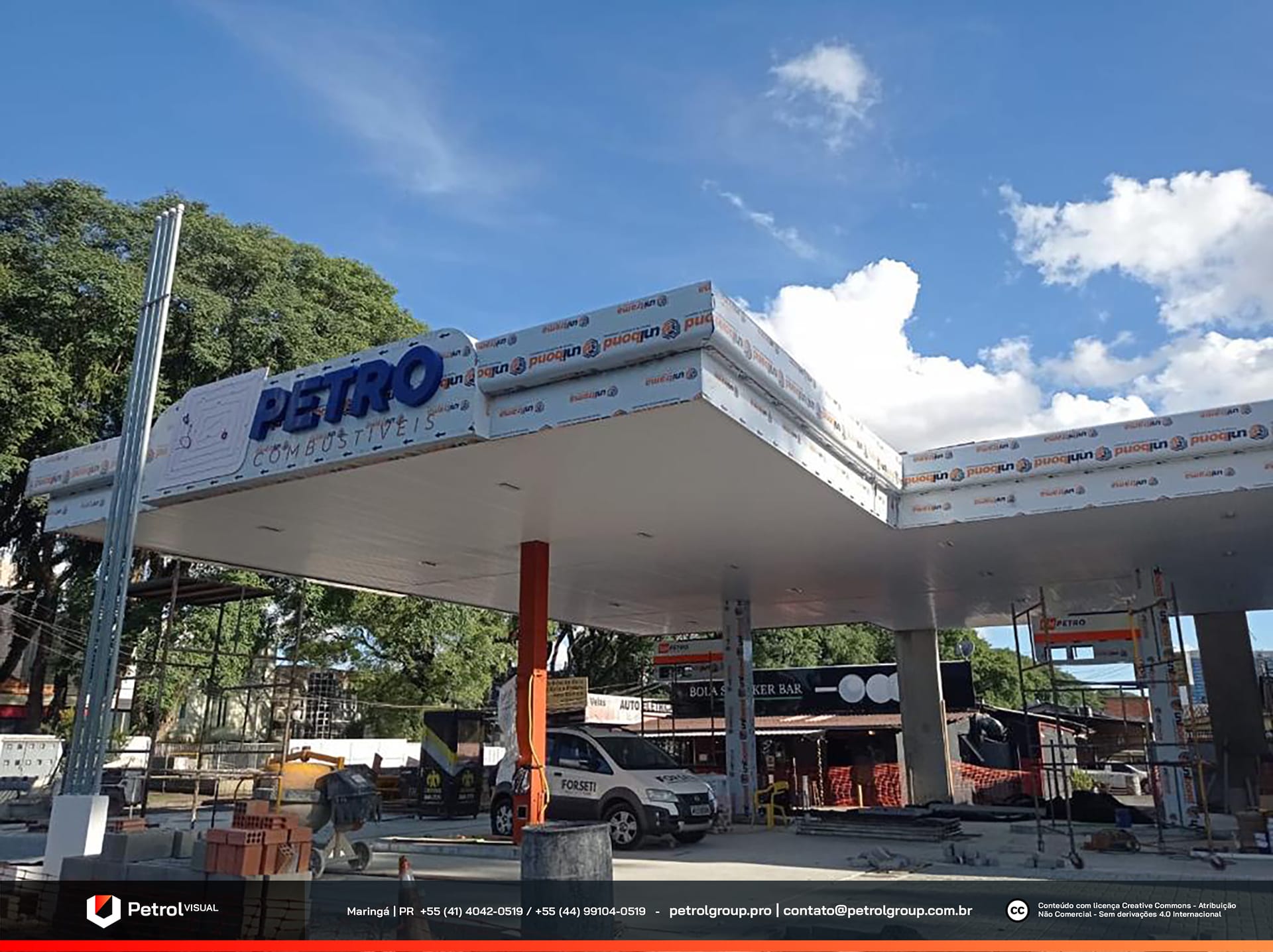
Check out the new gas station visual design! Located in Curitiba, this is the latest unit of the renowned ON Petro network, one of the strongest names in the sector in the region. After the successful renovation of Unit 1 in Curitiba, we were once again chosen for this project. Indeed, the high quality of our previous work was crucial for being selected to lead the work at the Jardim Ambiental unit. We are excited to bring the same excellence and innovation to this new venture and ensure an exceptional result.
SERVICES
| STORE FAÇADE | LOGO DESIGN |
| COLUMN CLADDING | PRICE TOTEM |
| PUMP COMMUNICATOR |
PRODUCTION
The gas station yard received a carefully planned visual design that harmonizes all elements of the unit. We installed white ACM cladding on the columns, creating an elegant contrast with the stylized pump communicators. These communicators, made in gray, feature vibrant orange and blue details, standing out and complementing the overall aesthetic of the space.
Additionally, we transformed the convenience store with ACM elements, following the brand’s standard colors. This ensures that the store seamlessly integrates with the yard’s design and maintains the network’s visual identity. This attention to detail and color consistency not only enhances the appearance of the space but also provides a visually pleasing experience for customers.

Gas Station FaÇade: REDE ON PETRO
Our team paid great attention to the station’s canopy, addressing the owners’ specific requests for it to become the focal point of the unit’s visual design. In response to these demands, we designed and executed the canopy with extreme care.
Firstly, we manufactured the canopy entirely in ACM, using the brand colors to ensure a striking visual impact. Blue, a key color in the brand’s identity, was prominently highlighted, helping to create a strong and attractive visual presence. Additionally, we added embossed details to the canopy, providing extra dimension to the design and increasing the visibility of the focal point.
Furthermore, we positioned the brand’s logo with stylized uppercase letters, integrating it harmoniously into the canopy’s design. This attention to detail not only reinforces the network’s visual identity but also ensures that the station stands out and is easily recognizable to everyone passing by. Thus, we managed to transform the canopy into a central and impressive element of the gas station’s visual design.
Related Works

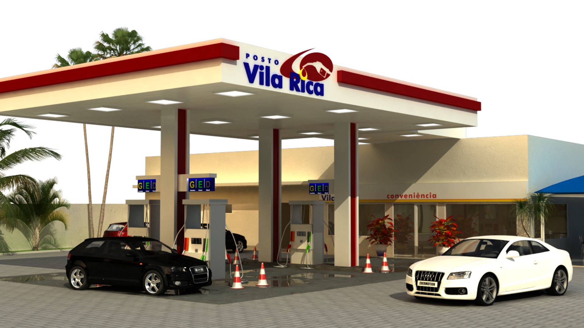
Vila Rica gas station design
