FILLING STATION VISUAL DESIGN
ZAPA GAS STATION CHAIN

OVERVIEW
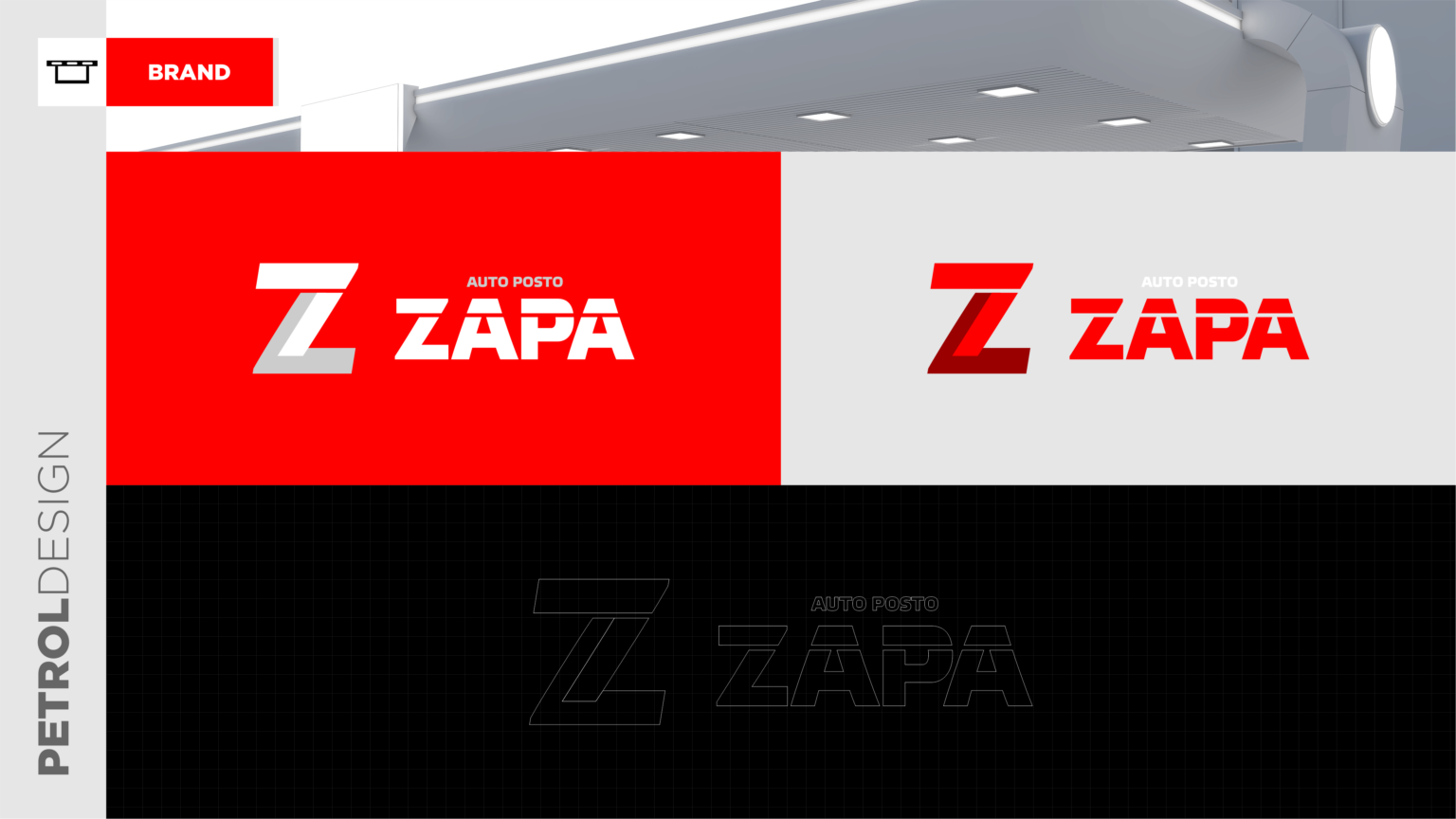
Around 10 years ago, we started working with the Zapa Gas Station Network, developing visual identity projects and implementing the visual communication of their fuel stations. The Ponta Grossa unit is the newest addition to the network, where we have created a more modern and updated visual identity, including a redesign of the brand with a modified “Z” icon.
SERVICES
| BRAND | CONSULTANCY |
| INTERIRO DESIGN | |
BRAND
The brand underwent a rebranding process. Previously, it had a stylized font where the letter “Z” itself served as the symbol. We have developed a new brand with a well-defined symbol for the new visual identity of this fuel station.
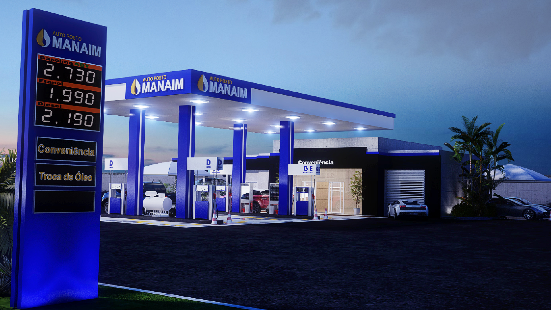
GAS STATION
Changes were made to the colors of the gas station, replacing white with silver, which provides ease of cleaning and a more contemporary image. A robust canopy was created to highlight the fuel pumps, and custom designs were applied to the fuel dispenser cabinets. Structural columns received decorative cladding, such as merchandising panels and illuminated strips. For the building itself, a classic design with brick cladding was chosen, completing the new visual identity of the gas station chain.
Related Works
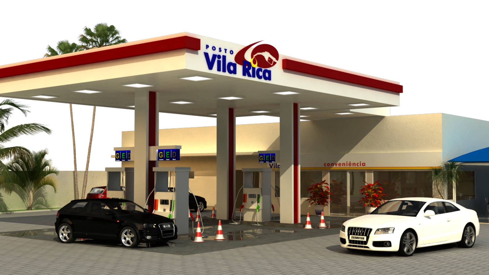
Vila Rica gas station design