GAS STATION VISUAL DESIGN
BELLA+

OVERVIEW
An old gas station, named Bella Torres and located in Passo de Torres, Santa Catarina, had an outdated visual image and needed a complete revitalization. The owners decided to create a new brand with a fresh visual identity and also update the name to something shorter, thus giving rise to the name Bella+ Gas Station.
SERVICES
| VISUAL IDENTITY | UNIFORMS |
| 3D MOCKUP | DESIGN STANDARDS |
| LOGO DESIGN | |
| 3D PROJECT |
LOGO DESIGN
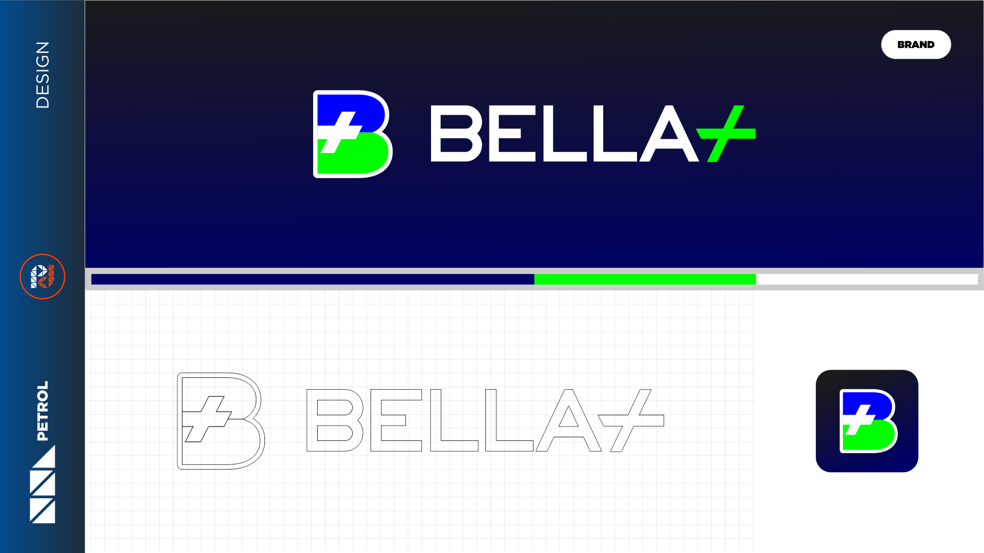
We created the new Bella+ brand with a symbol in the initial letter “B” and applied the desired colors of blue, green, and silver in a well-balanced manner. The white and green were illuminated to convey a sense of nature and ecology, considering that the gas station already had several flower beds and landscaping throughout the premises.
UNIFORMS
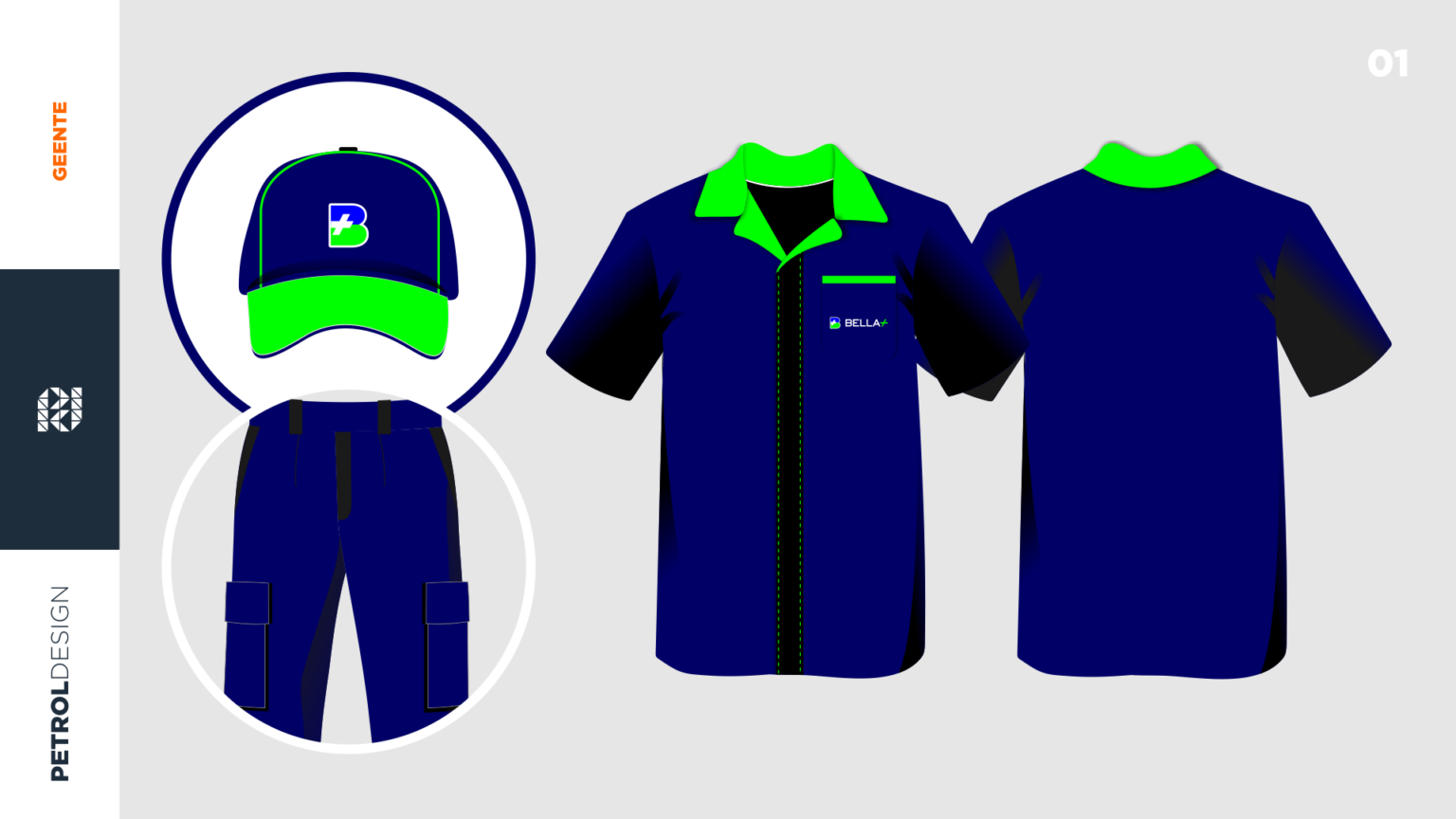
Development of Uniform Kit for Bella+ gas station: We created all the uniforms for the attendants, administration, and convenience store staff, while maintaining the visual standards of the brand.
3D VISUAL IDENTITY
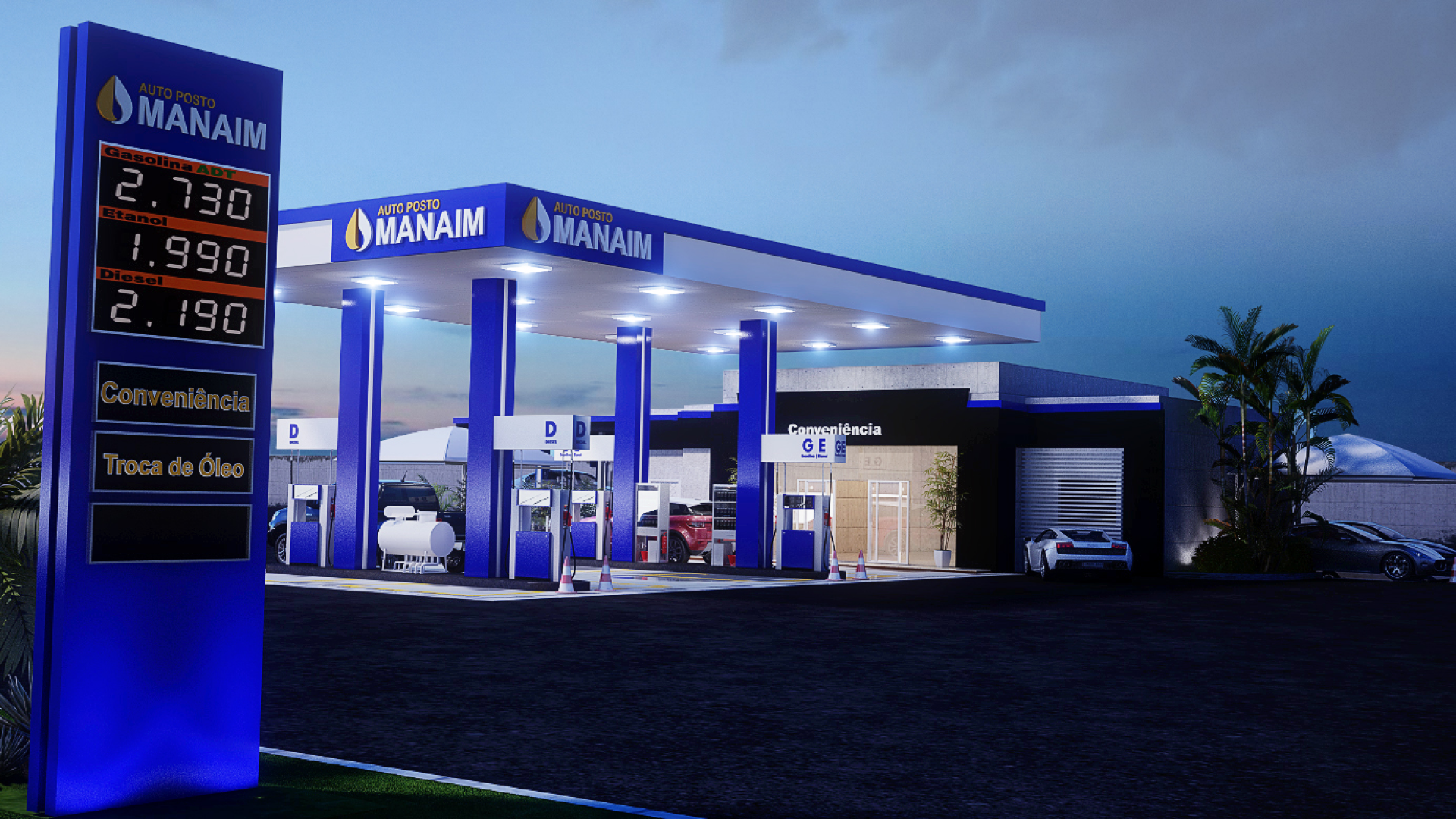
Development of all visual elements of the gas station, including the facade of the service and administration building. We designed an eye-catching totem that featured vertical stripes, following the same pattern as the canopy to harmonize with the other elements.
DESIGN STANDARDS
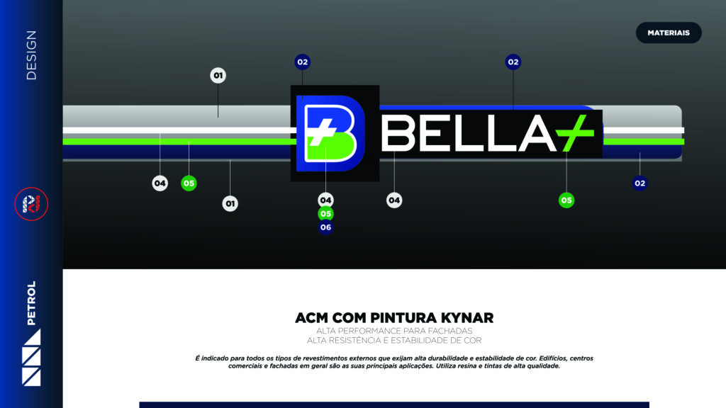
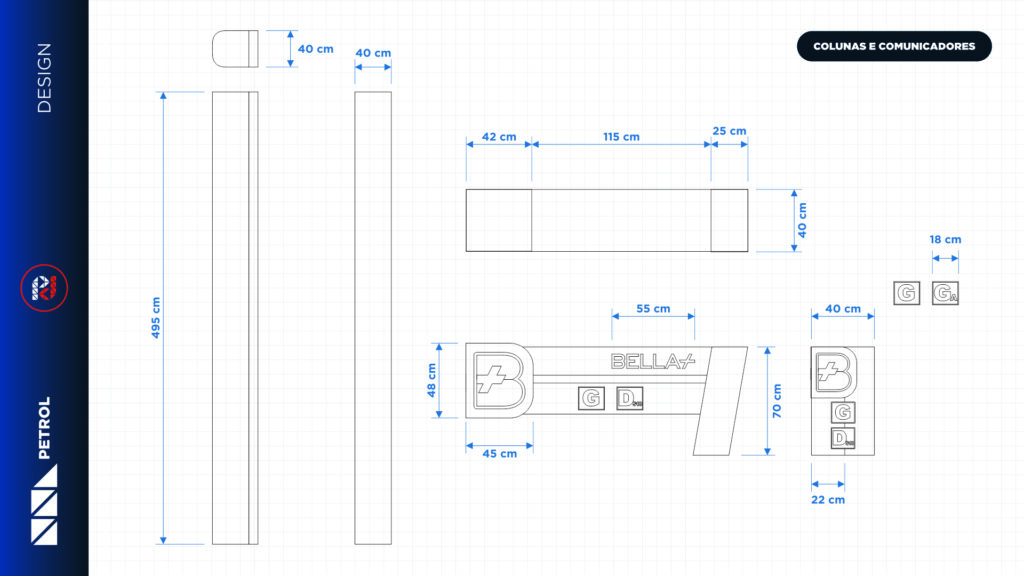
With the approved visual design of the Bella+ gas station, we have concluded our work by delivering the descriptive report, which includes measurements, views, and detailed information about materials, colors, textures, and lighting.
Related Works
Vila Rica gas station design
