Fuel station brand identity directly influences how american drivers choose where to stop. A professional and trustworthy appearance encourages customers to enter your forecourt, increases fuel sales, and strengthens convenience store profitability. Since major brands such as Shell, Chevron, and ExxonMobil invest heavily in branding, independent stations must differentiate themselves to remain competitive in every market.
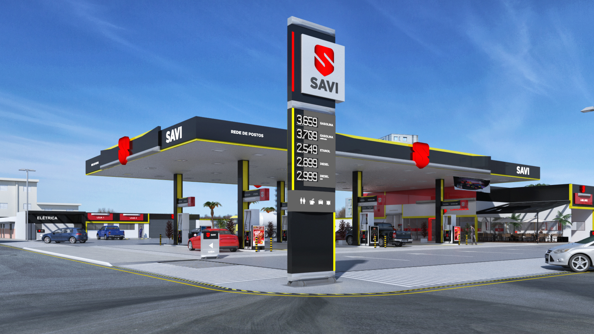
A strong fuel station brand identity goes well beyond the canopy or the price sign. Customer perception begins at first sight and shapes refueling decisions through trust, convenience, and professionalism. A clean and recognizable look positions your station as the preferred stop along any route.
Key steps to creating a successful fuel station brand identity
Know your audience
Different locations attract different drivers. Some stations cater to daily commuters, while others depend on long-haul truckers or families traveling between states. When visual communication reflects those specific needs, customers feel understood and choose your business more often.
Develop a unique visual identity
Distinctiveness builds immediate recognition. A memorable logo aligned with your positioning communicates what makes your station valuable. For instance, sustainability messaging can be reinforced through green tones and soft, clean shapes.
Maintain consistency across customer touchpoints
Brand messaging must be cohesive across all physical and digital elements. A unified color palette, typography, signage system, pump decals, staff uniforms, and online presence improve recognition from a distance. Consistency builds trust, especially in unfamiliar locations.
The logo: core of your fuel station brand identity
Drivers have only seconds to make a decision at highway speeds. A compelling logo ensures they do not miss your station.
Simplicity ensures instant recognition
Bold symbols, high contrast, and geometric shapes improve readability from any angle. A simple logo adapts well to both large signage and small displays without losing clarity.
Visual style aligned with your promise
If your focus is speed and affordability, dynamic shapes and expressive typography reinforce that message. Stations offering premium experiences benefit from refined visual details that communicate comfort and quality.
Strategic color and typography choices
Color influences emotional responses and decision-making:
- – Red: urgency, energy, and active service
- – Blue: trust, safety, and reliability
- – Green: sustainability and environmental values
- – Yellow: visibility and convenience
Typography must always support quick reading in motion. Contemporary fonts convey agility and innovation, while traditional fonts signal heritage and stability. When aligned, these elements build a professional message customers understand instantly.
Discover: How to choose the color for your gas station
Invest in a custom fuel station brand identity
A tailored brand identity protects your business from legal risks related to imitation of national brands. It also increases long-term valuation and supports compliance with U.S. standards, including ADA readability requirements and durable exterior materials built for UV exposure, fuel vapors, and challenging weather conditions.
Stand out and win more customers
A professional fuel station brand identity:
- – Attracts more traffic from passing vehicles
- – Increases convenience store revenue
- – Strengthens customer loyalty and repeat visits
- – Enhances price perception and competitiveness
- – Differentiates your station in crowded markets
Want to make a difference and guarantee your station’s success? Count on the support of the only business group exclusively dedicated to the fuel station sector in Brazil, with over 25 years of expertise and personalized consulting. Contact us for more information!
With Petrol Group, you have everything your gas station needs in one place!