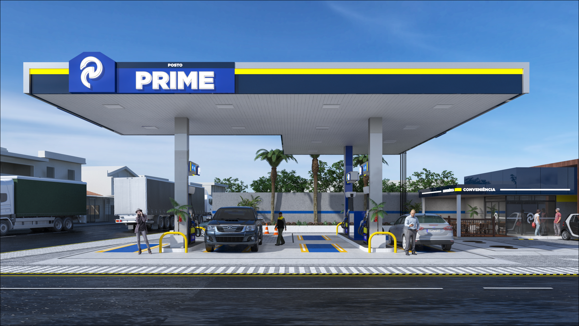


GAS STATION VISUAL DESIGN · CRICIÚMA/SC
ANGELONI
OVERVIEW
The team developed the visual design for Posto Angeloni, in Criciúma/SC, with the goal of reinforcing the Angeloni brand's presence in the region while connecting corporate identity, modernity and operational efficiency. In addition, we translated the network's values of reliability, quality and convenience into a contemporary visual language, giving customers a clear, straightforward and memorable experience from arrival to departure. What is more, the project considers the safety and comfort of all users, aligning functionality with aesthetics without giving up the brand's premium positioning.
Services
| DESIGN | LOGO |
| DESIGN SPECIFICATIONS | DESIGN KIT |
PROJECT
The unit's architectural and functional design was conceived to balance operational efficiency, safety and modernity. In this sense, the layout clearly organizes the light-vehicle and heavy-vehicle fueling areas, integrates the convenience store and separates vehicle flow. In addition, to comply with DNIT and ARTERIS regulations, the project ensures safe circulation, proper road access and visible signage, which allows trucks and light vehicles to operate without interference.
The infrastructure already provides for future expansions and, at the same time, adopts strategic lighting solutions that ensure nighttime visibility and enhance the unit's architecture. Customer parking areas also make it easy to reach the convenience store and the associated businesses, without compromising visibility or the readability of the main signage.
The project mapped the peak traffic hours (7:00–9:00 a.m., 11:00 a.m.–12:30 p.m. and 4:00–7:00 p.m.), allowing the signage to work efficiently at peak times. Additionally, the station operates 24 hours, ensuring that the entire customer journey is covered.
VISUAL DESIGN POSTO ANGELONI
Posto Angeloni designed its brand identity to express the strength of the brand through a contemporary and functional language. In this context, the team designed the canopy with continuous communication and strategic lighting, ensuring high visibility both day and night. In addition, the chromatic contrast of blue, orange and black reinforces the brand's presence and makes prices and services readable at a glance.
The designers conceived the project elements — such as slightly rounded or straight finishes — to convey technology and modernity without rigidifying the brand's identity. In addition, the team intensified the signage to guide users correctly, highlighting fuel dispensers, products, payment areas, restrooms and parking.
The visual design also integrates associated businesses, such as the distribution center and restaurants, ensuring that communication and lighting remain consistent with the entire customer experience. In this way, the station offers a clear, efficient and memorable journey from entrance to exit, reinforcing the premium standard of the Angeloni network, with a gas station signage.
Related Works
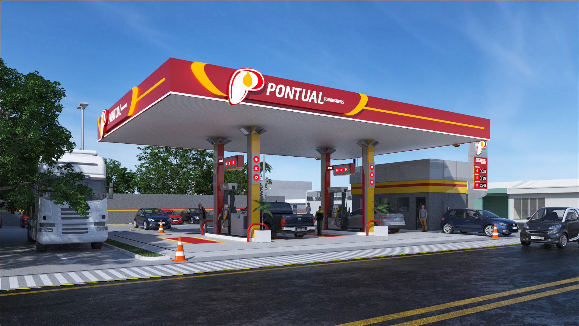
Pontual gas station design