




GAS STATION BRAND IDENTITY · CRISTALINA/GO
CAMPOS LINDOS GAS STATION

OVERVIEW
Discover the Campos Lindos gas station brand identity! We developed the brand identity project to highlight the region and create a brand that combines modernity, sophistication and functionality. Located in the Campos Lindos district, in Cristalina, Goiás, the gas station mainly serves the lower and middle classes, offering fuels such as Regular Gasoline, Premium Gasoline, Diesel, Diesel S10 and Ethanol. To achieve this goal, we combined representative elements of the fuel sector with a striking, harmonious design. As a result, the new brand identity reflects the region’s values, reinforces the gas station’s presence in the market and delivers a unique, engaging visual experience.
Services
| 3D PROJECT | BRAND IDENTITY |
| LOGO | DESIGN |
BRAND IDENTITY PROJECT
First, we drew the main icon as a stylized oil drop, which represents the fuel sector and, at the same time, subtly forms the initials “C” and “L” of Campos Lindos. Next, we arranged the name “CAMPOS LINDOS” in capital letters inside a central circle, set on two lines just below the icon. To complete the composition, we added the inscription “AUTO POSTO” on a third line, using a smaller font to ensure balance and visual appeal.
As for colors, we chose intense orange, royal blue and white as the predominant ones, since these tones convey the brand’s essential values. Orange communicates energy and vibrancy, royal blue reinforces reliability and sophistication, while white creates contrast and harmony. The result is a modern, dynamic brand identity perfectly aligned with the fuel sector.
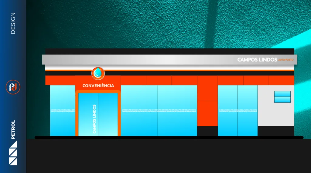
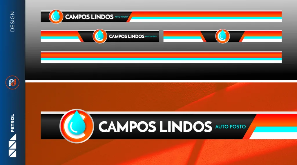
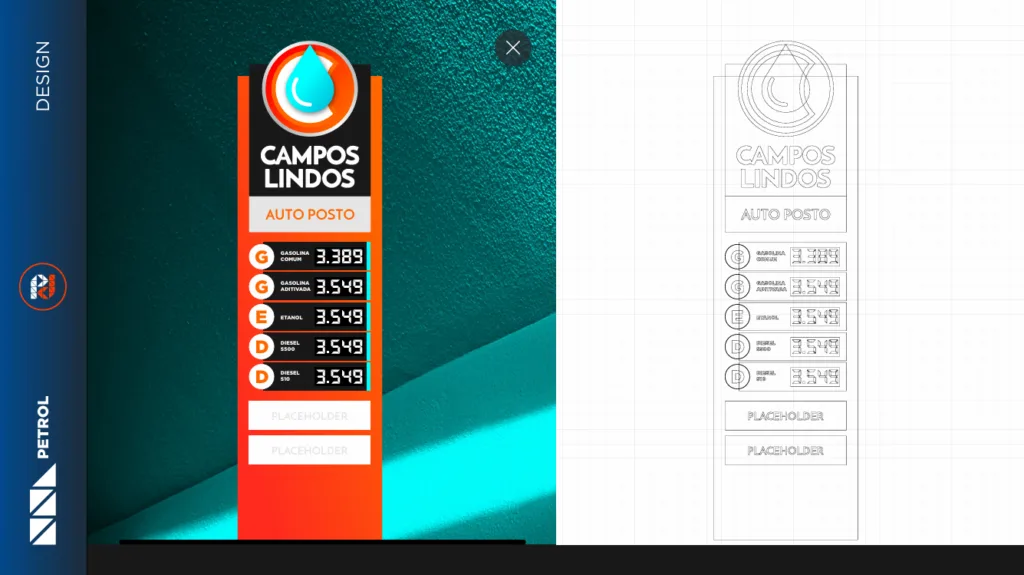
We adopted a modern, minimalist design, with straight strokes, soft curves and rounded details to complement the Campos Lindos gas station’s brand identity. We incorporated elements such as the fuel dispenser, the fueling nozzle and the oil drop in an integrated way, creating a sophisticated image. Intense orange predominates, balanced by royal blue and white, resulting in a radiant, modern look.
Finally, with a striking logo and a design that balances modernity and vibrancy, we positioned the Campos Lindos gas station as a benchmark in the sector, meeting customers’ needs and delivering a memorable experience, with a gas station architecture projects.
GAS STATION BRAND IDENTITY: CAMPOS LINDOS
Related Works

Pontual gas station design
