FUEL STATION VISUAL DESIGN
MARINHO

OVERVIEW
The Marinho family name in Minas Gerais is deeply rooted in tradition, so it was only fitting to maintain this name in the logo of a beautiful gas station. In this Visual Communication project, the clients wanted to incorporate the colors blue, yellow, orange, white, and red. However, based on our design expertise, we knew that using such a wide range of colors in a single project could be overwhelming.
SERVICES
| VISUAL IDENTITY | UNIFORMS |
| 3D MOCKUP | DESIGN STANDARDS |
| LOGO DESIGN | |
| 3D PROJECT |
LOGO DESIGN
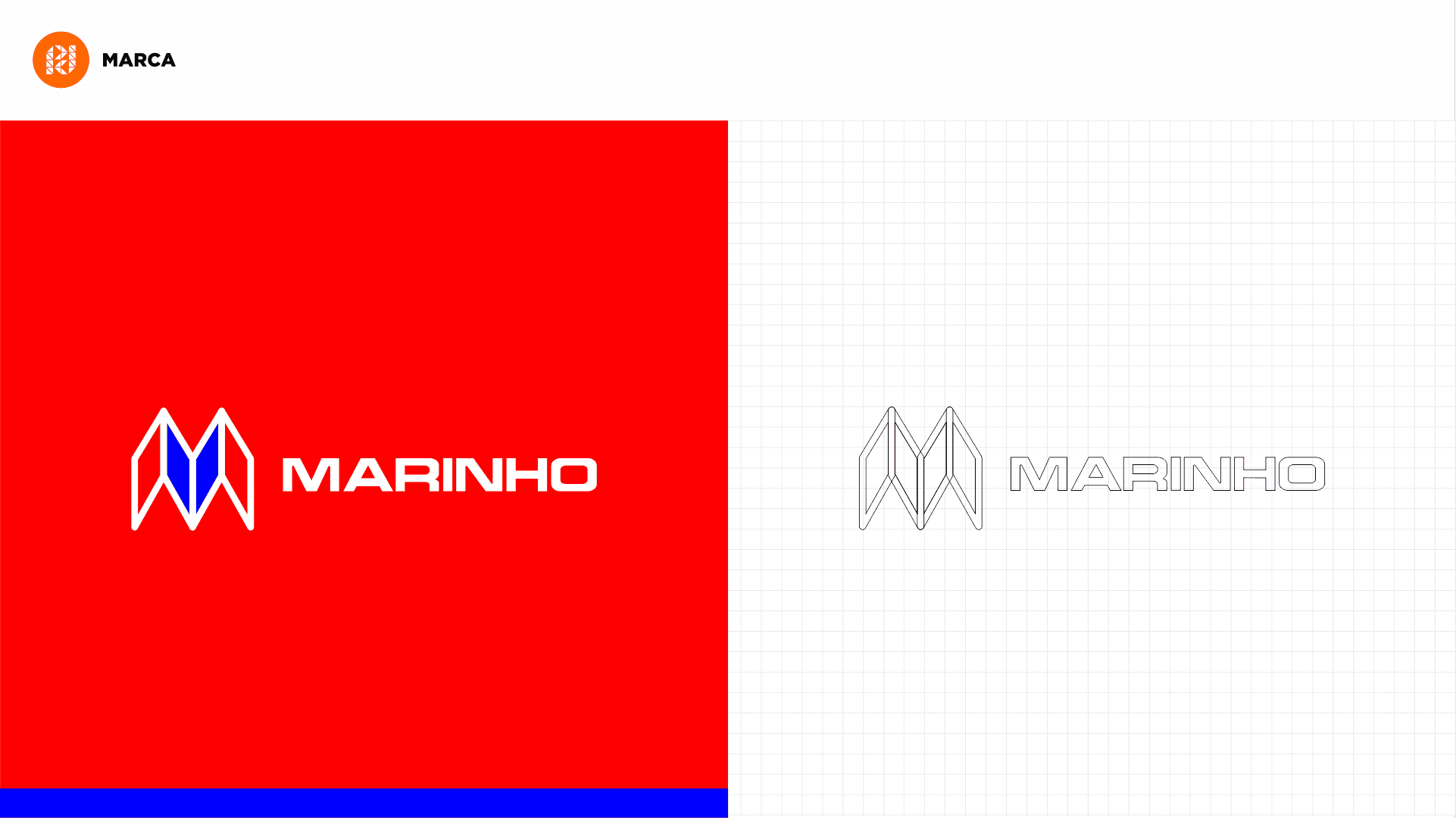
We opted for the stronger and more vibrant colors, which were blue and red, while silver was used as a neutral color. To meet the initial requests of the Marinho family, we designed the visual elements with straight lines and some gentle curves. For example, in the canopy, there are smooth curves at the bottom and straight lines at the top, with an overhang for indirect lighting.
UNIFORM
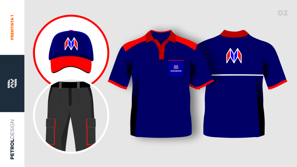
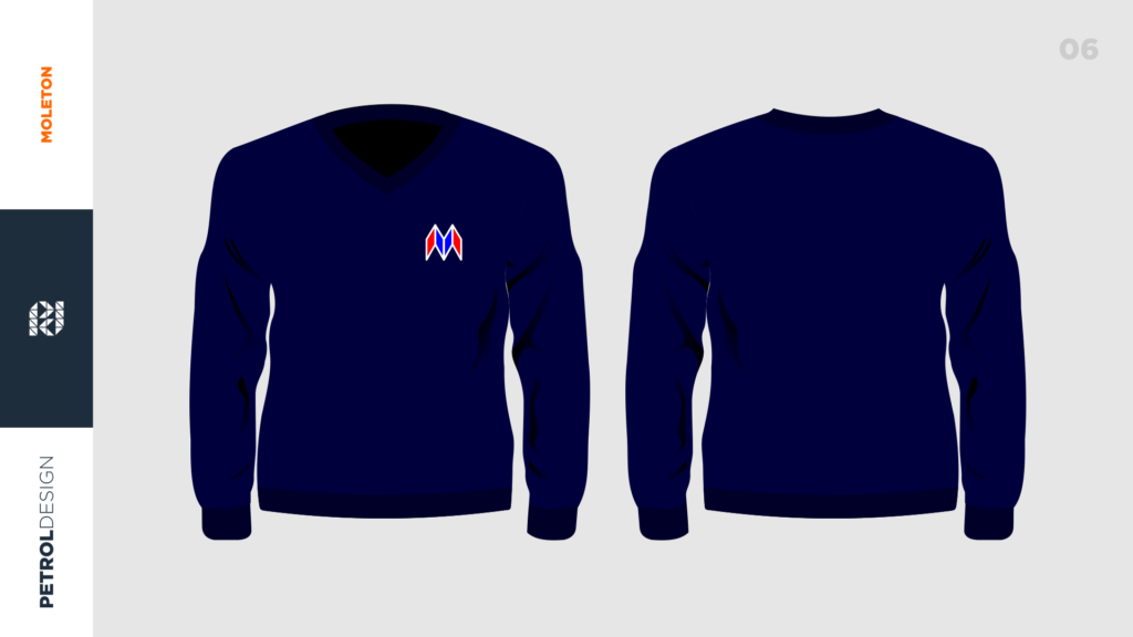
Development of Uniform Kit for Marinho Gas Station. We created all the uniforms for the attendants, administrative staff, and convenience store employees, while maintaining the visual standards of the brand.
3D VISUAL IDENTITY
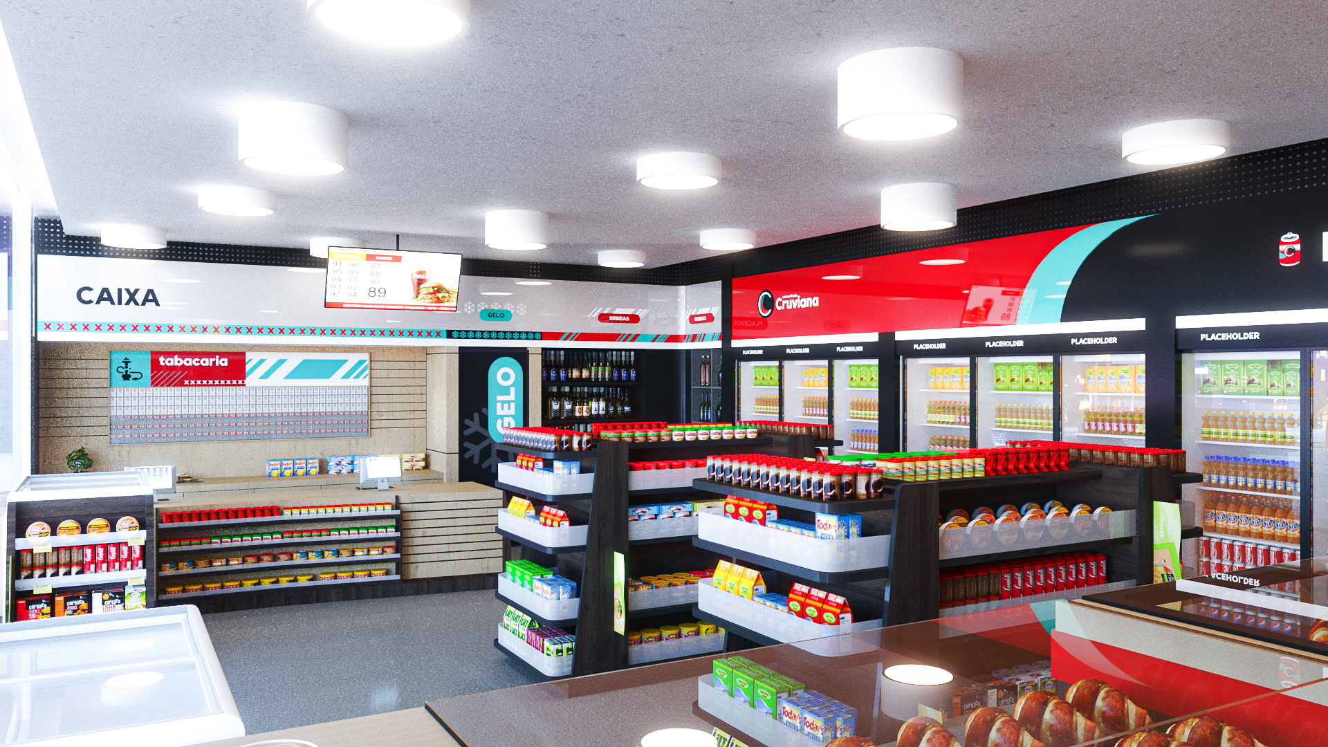
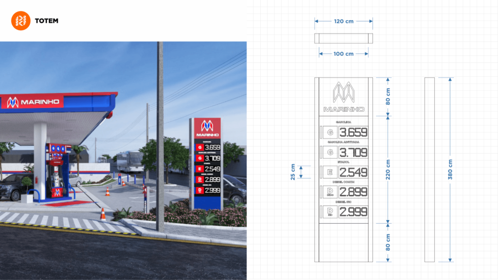
Due to the number of buildings in the vicinity of this gas station, the decision was made to have only one price totem. This is because the visibility of a totem with the brand would be limited, as the buildings would obstruct it, making it an unnecessary expense. The idea was for the Marinho Gas Station brand to have a strong visual impact and be easily memorable.
DESIGN STANDARDS
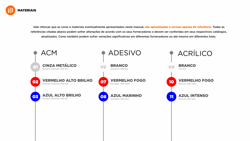
The visual communication of this gas station in Minas Gerais turned out impressive. With the approved project, we concluded our work by delivering the descriptive memorial, which includes measurements, views, and detailed information about materials, colors, textures, and lighting.
Related Works
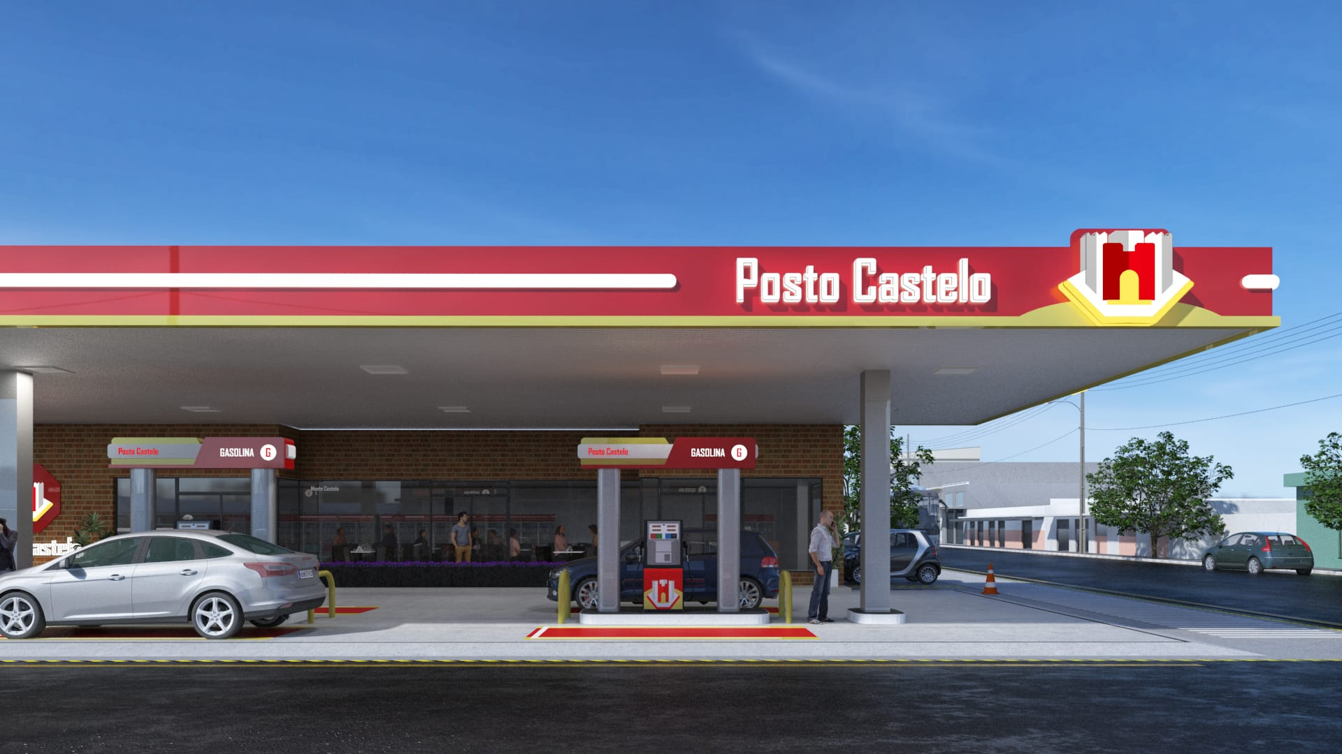
Gas station design project Castelo
