GAS STATION FASCIA
CRUVIANA
OVERVIEW
Located in Boa Vista, in the state of Paraná, the owners of this gas station hired PETROL VISUAL to build the new gas station fascia and all structural and visual elements of the establishment. From the very beginning of the project, our team dedicated itself to every detail, ensuring a high-standard final result. As a result, we completely revitalized the station’s appearance, making the space more attractive and functional. In addition, the new visual design directly contributed to an increase in customer traffic, reinforcing the importance of a well-executed visual project.
SERVICES
| COLUMN CLADDING | PUMP SIGNAGE |
| PROJECT | PRICE TOTEM |
| STORE FRONTAGE | CANOPY FASCIA IN ACM |
PRODUCTION
For the new fascia design of the Cruviana gas station, we chose two shades of blue combined with white. This palette created a modern and attractive visual identity. In addition, we used white to highlight key elements and reinforce the brand’s presence. The red from the logo added contrast and personality, which made the composition even stronger.
Next, we clad the columns with ACM in white and dark blue. This choice ensured excellent visibility and visual harmony. We also developed exclusive pump toppers for this location. They feature unique construction and a distinctive design, which further elevates the entire project.
Each element was carefully planned to improve daily functionality. Moreover, these decisions help enhance the customer experience. As a result, we delivered a cohesive and elegant project aligned with the station’s vision. Overall, the redesign supports its revitalization and increases its prominence in the region.
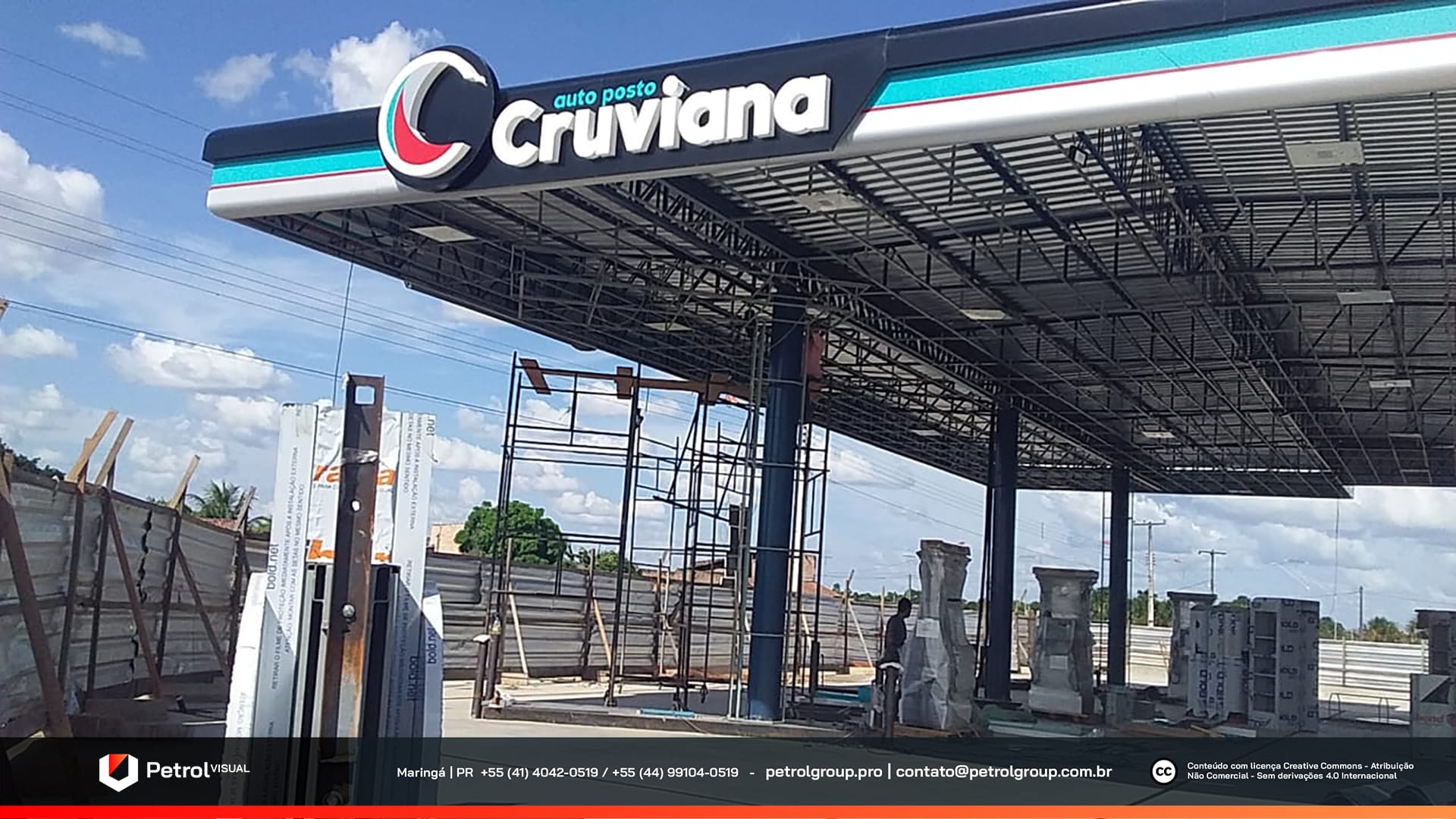
Cruviana Gas Station Façade
The façade underwent a complete revitalization. First, it received ACM cladding in the station’s colors. This upgrade modernized the structure and added more elegance to its appearance. In addition, we applied the brand’s logo on all sides of the fascia, which increased visibility and strengthened the visual identity.
Meanwhile, the convenience store also received significant improvements inside and outside. We used black and red throughout the space to create a strong visual composition. These choices aligned the store with the unit’s overall concept. To enhance communication, we also installed canvas-style panels with clear and direct information about the station’s main products.
As a result, the entire structure became more modern, and communication more efficient. Ultimately, these changes made the environment more appealing and elevated the station’s perceived quality.
Related Works
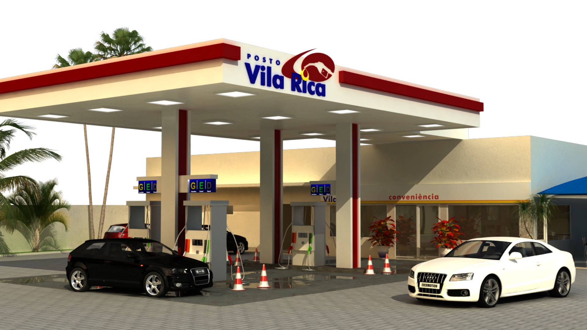
Vila Rica gas station design