




GAS STATION DESIGN · ARIPUANÃ/MT
FLEX
OVERVIEW
The design project for Posto Flex was developed to create a modern, simple and easily recognizable brand identity. Inspired by the concept of movement and energy, the project uses the flame symbol as the main element of the brand, reinforcing dynamism and visual presence. The combination of red, white, black and gray creates a striking look, conveying quality, trust and competitiveness. As a result, the station stands out in the Aripuanã/MT region, strengthening its presence and making it easier for drivers to identify.
Services
| DESIGN | LOGO |
| DESIGN SPECIFICATIONS | DESIGN KIT |
PROJECT
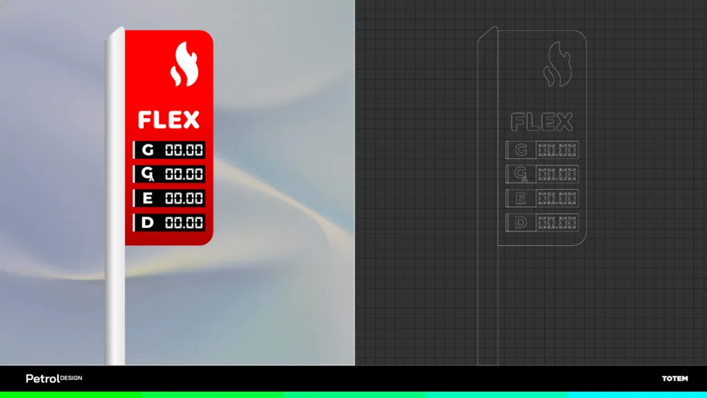
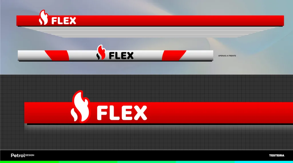
The design of Posto Flex integrates brand identity, operations and customer experience into a single concept. In addition, the layout strategically organizes the fueling islands for gasoline, ethanol and diesel, ensuring smoother flow during peak hours. At the same time, the signage was directed to provide quick recognition of the brand and the services offered. Another highlight of the project is the emphasis on the price sign, separate from the main identity, which makes it easier for drivers to read before even entering the station.
In addition, the proposal includes functional parking, an integrated convenience store and efficient circulation, creating a more organized, practical and attractive environment for customers and employees.
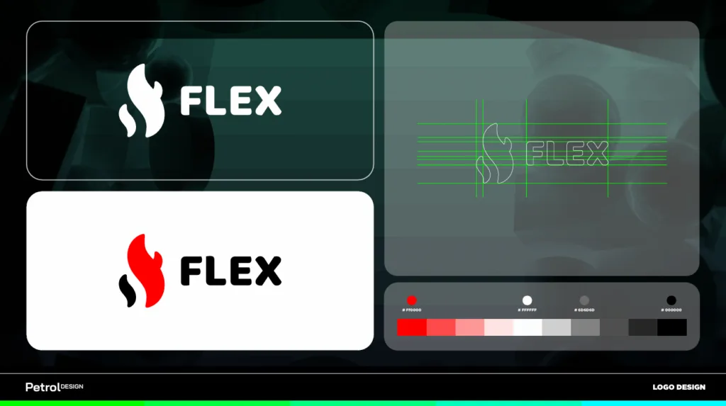
In turn, the Posto Flex brand relies on a symbol inspired by a flame, representing energy, movement and fueling. In addition, the icon has slightly rounded shapes, giving it a modern and approachable look. Likewise, the robust typography reinforces the perception of trust and makes it easy to read from a distance, while the red, white, black and gray palette ensures high contrast and excellent application on the canopy fascia, the price sign and all the signage.
GAS STATION DESIGN FLEX
The design of Posto Flex strengthens the brand through a contemporary brand identity and efficient communication. In addition, the combination of a modern facade, functional layout and visual standardization helps improve the customer experience, increase the perception of quality and position the business more competitively in the market.
In this way, the project creates a consistent visual presence, conveying trust and professionalism at every point of contact with the public. As a result, the station is better prepared to grow, win new customers and stand out as a reference in the region.
Related Works

Pontual gas station design
