GAS STATION RENOVATION
PHOENIX GAS STATION CHAIN
OVERVIEW
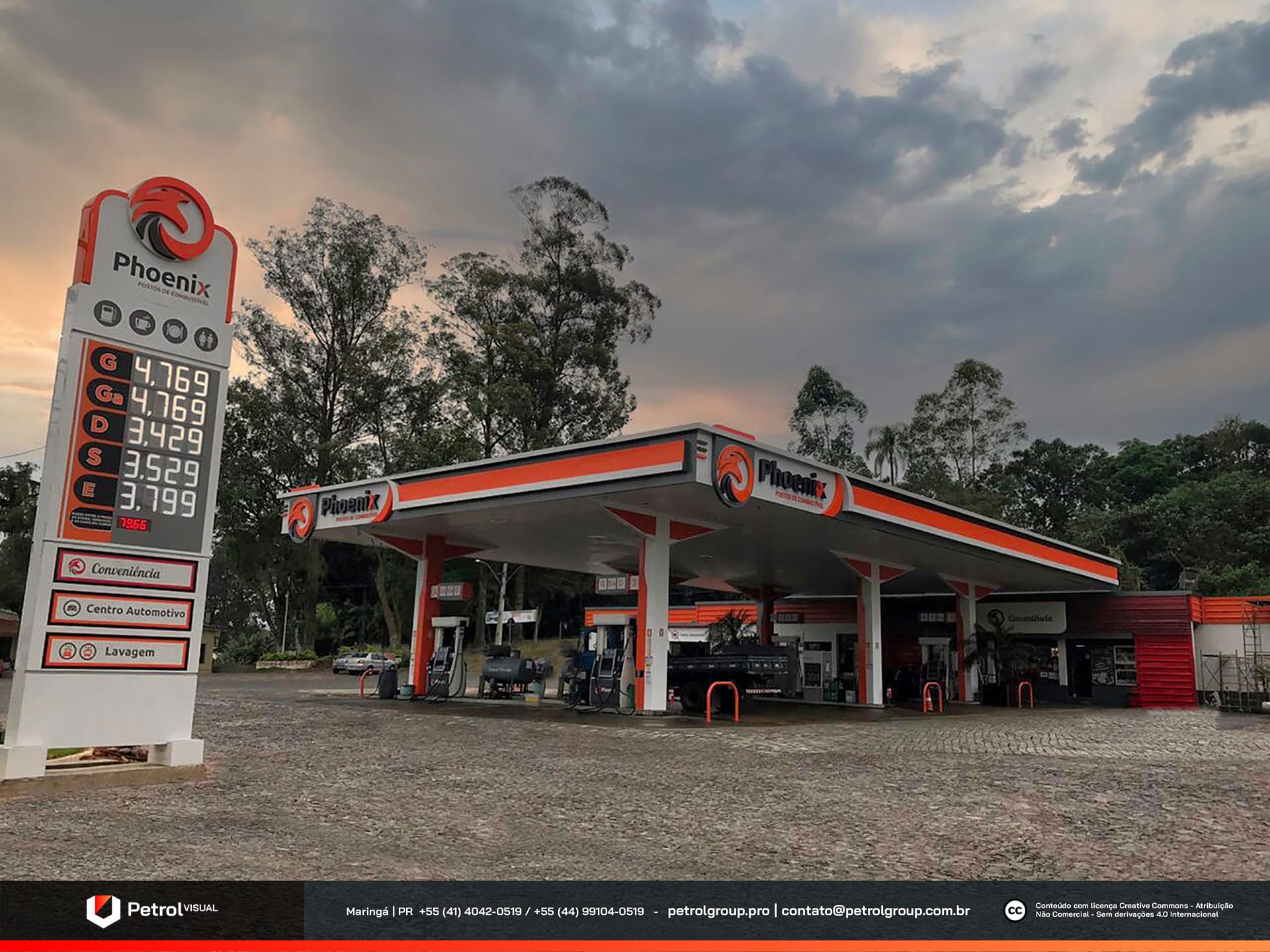
Discover the transformation of the Phoenix gas station chain! With a strong presence throughout the state of Rio Grande do Sul, Phoenix stands out as one of the most renowned fuel brands in the region, recognized for its high-quality services and competitive pricing. Our team was entrusted with revitalizing all units of the chain, giving them a modern and visually striking appearance. To achieve this goal, we meticulously refined every detail, ensuring that the renovation not only refreshed the aesthetic of each location but also reinforced the Phoenix brand identity. The result is a contemporary design that reflects the brand’s excellence while capturing even greater customer attention. With this new visual identity, Phoenix reaffirms its leadership in the market, setting a new benchmark in service station aesthetics.
SERVICES
| CANOPY | PRICE TOTEM |
| COLUMM CLADDING | PUMP COMUNICATOR |
PRODUCTION
The brand’s signature colors play a fundamental role in shaping the identity of each gas station, seamlessly applied across all elements and components of the units. This consistent use of color reinforces brand recognition while creating a visually harmonious and cohesive environment at every location.
The interplay between these meticulously coordinated elements results in a refined and engaging atmosphere, ensuring that each component complements the overall design. This careful attention to detail enhances the customer experience, offering a visually appealing and well-structured space. Furthermore, this cohesive design strengthens the brand’s presence while establishing a welcoming and distinctive environment that leaves a lasting impression on visitors.
PHOENIX GAS STATION CHAIN FAÇADE
As part of the renovation, we equipped Phoenix gas stations with top-tier materials and construction techniques, ensuring a distinctive and sophisticated look. Every unit now features premium components that elevate the brand’s image while maintaining the highest industry standards.
One of the standout elements of the redesign is the canopy, which has been entirely constructed using ACM panels in the brand’s signature colors. This not only enhances visual appeal but also creates a cohesive and polished aesthetic. Additionally, we integrated backlit illumination to maximize visibility and impact, ensuring the station remains highly recognizable even at night.
The Phoenix logo has been strategically positioned on all sides of the canopy, reinforcing brand consistency and presence from every vantage point. This renovation goes beyond modernization—it strengthens the brand’s identity in a bold and effective way. The result is a visually impressive and highly functional environment that enhances both the customer experience and the station’s market presence.
Related Works
Vila Rica gas station design