GAS STATION FACADE
IPANEMÃO
OVERVIEW
Discover the gas station facade Ipanemão in Itaporã (MS)! The owners of the station hired PETROL VISUAL with a clear goal: to transform its facade. From that moment on, our team embraced the challenge with dedication. In addition, we aligned every stage of the project with the clients’ expectations. Throughout the process, we carried out detailed and collaborative creative work. As a result, the unit received a new visual identity that reflects professionalism and clarity. Moreover, we developed a facade that is modern, attractive, and fully revitalized. This transformation not only enhances the brand but also attracts more customers and reinforces the commitment to quality.
SERVICES
| ACM CANOPY FASCIA | STOREFRONT FAÇADE |
| COLUMN CLADDING | PRICE TOTEM |
| PUMP COMMUNICATOR | SIGNBOARD |
PRODUCTION
Since the station is strategically located in a high-traffic area, with heavy vehicle flow and many potential customers, the owners requested a striking visual solution. Their goal was to highlight the gas station’s facade and capture even more attention. With this challenge in mind, our team took on the project from the start, focusing on visibility, modernity, and brand presence.
To begin the transformation, we designed and installed a price totem over five meters high. It quickly became one of the main elements of the new visual identity. Moreover, we built the structure with ACM panels, which ensured durability, a high-quality finish, and a bold look that stands out in the urban landscape.
Next, we strategically applied the company’s logo to the top of the totem. This step reinforced the station’s identity and made it easier for drivers to recognize the brand. In addition, we integrated high-brightness LED panels, which provide excellent visibility of fuel prices at any time of day—even at night. As a result, we optimized customer communication and strengthened the overall facade, creating a modern, professional, and highly attractive image.
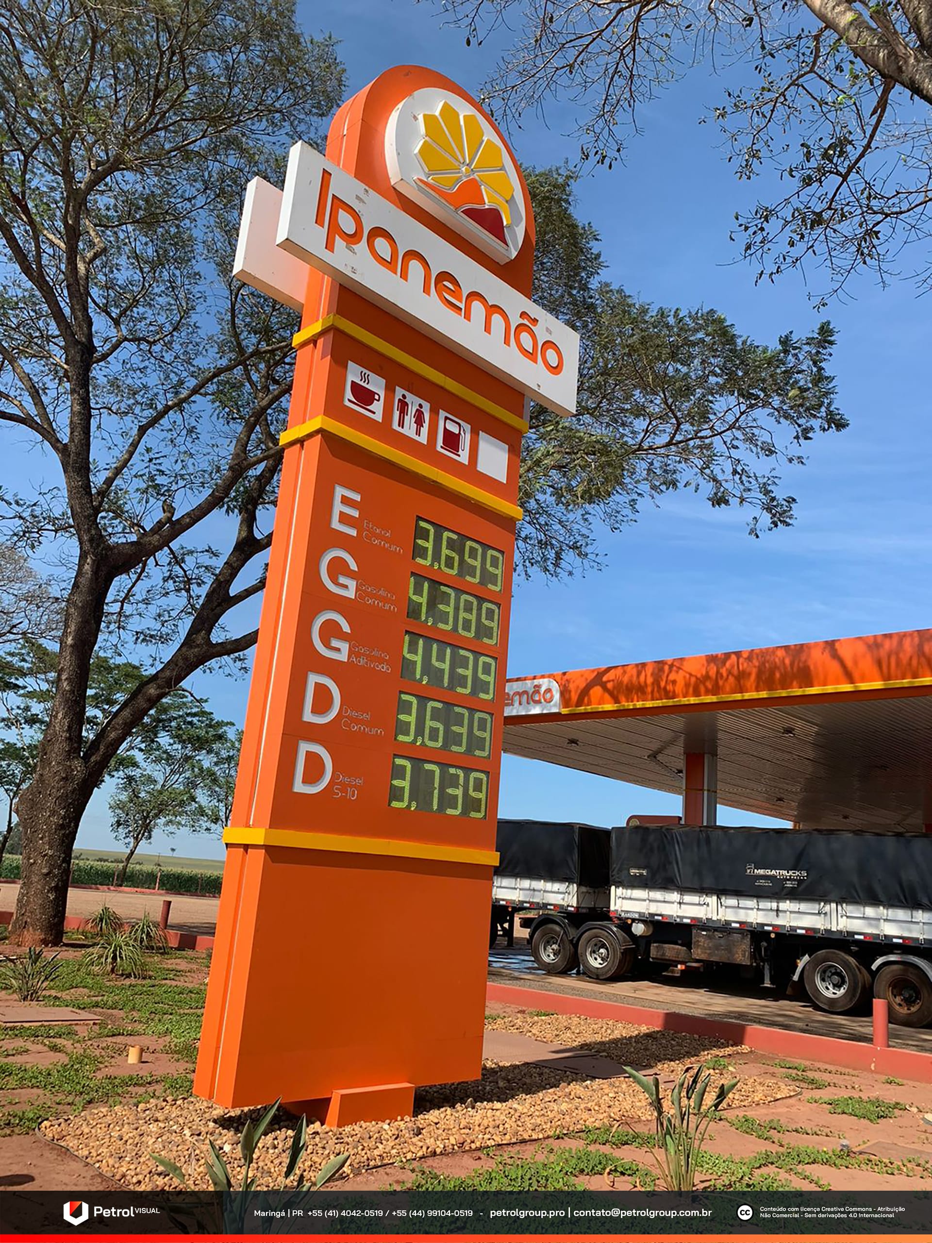
Ipanemão gas station facade
For the gas station facade, we chose a simpler and cleaner design. The goal was to keep the unit visually light and organized, while avoiding communication overload. From the very beginning, we aimed for balance between functionality and aesthetics. Therefore, we prioritized elements that convey professionalism and clarity.
With this approach, we manufactured the canopy fascia in orange ACM, which ensured a modern and vibrant look. As a complementary detail, we added a subtle yellow stripe. This choice created contrast and reinforced the brand’s identity. Moreover, we positioned the company’s logo on all sides of the fascia. As a result, visibility increased and brand recognition became stronger from every angle.
On the fueling area, we applied the same visual concept. To maintain harmony with the facade, we clad the columns in white and orange panels, achieving a consistent composition with the canopy. Finally, we installed flag-style pump toppers. These elements improved information readability and contributed to a more functional and attractive environment.
Related Works
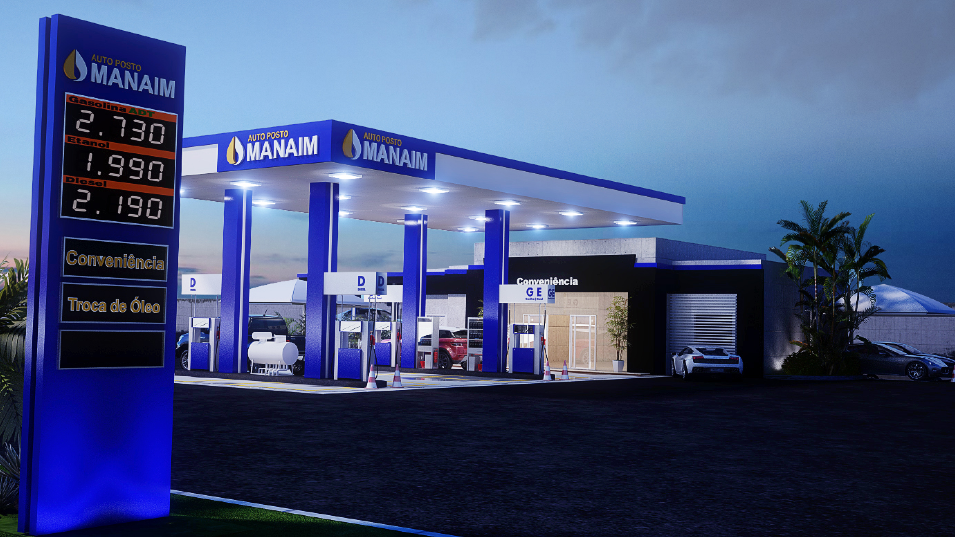
Vila Rica gas station design