GAS STATION FAÇADE
SHELL GAS STATION CHAIN
OVERVIEW
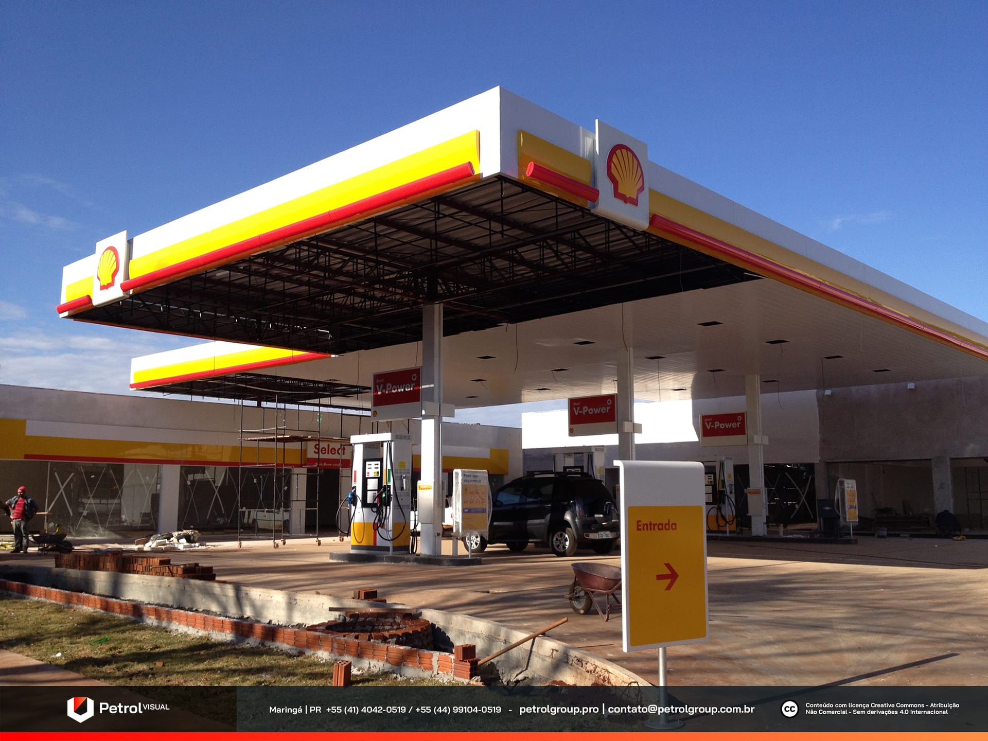
Located in the city of Maringá, in the state of Paraná, this Shell chain station reached out to us with the goal of developing a new proposal for its visual identity. From the very beginning, we understood that, since this is a well-established brand in the market, it would be essential to respect its trajectory and strong recognition among customers. With this in mind, we held a series of meetings with the owners to align expectations, fully understand their goals, and propose solutions consistent with the network’s visual standards. In addition, we sought to balance tradition and innovation, creating a façade that not only preserves Shell’s iconic elements but also conveys a renewed, impactful, and commercially attractive image. As a result, we delivered a cohesive and strategic visual project that remains faithful to the brand’s essence while enhancing its contemporary appeal.
SERVICES
| ACM CANOPY FASCIA | STOREFRONT FAÇADE |
| COLUMN CLADDING | PRICE TOTEM |
| PUMP COMMUNICATOR | SIGNBOARD |
PRODUCTION
We standardized the fueling area with strategic visual elements. This approach ensured uniformity and a strong identity across all units of the chain. To begin, we clad the support columns with white ACM panels, a choice that provided a clean, modern look while also being easy to maintain.
Next, we installed flag-style pump communicators with a sleek red design. This color reinforces the brand’s presence and immediately draws drivers’ attention during fueling. In addition, we positioned large fuel pumps that increase operational efficiency. These units also add to the imposing appearance of the station, enhancing both its visual impact and functionality.
To complement the project, we distributed brand totems throughout the site. This strategy reinforces the network’s identity and makes customer navigation easier. As a result, we created an organized, standardized, and highly attractive environment for the public.
Gas station façade: SHELL chain
We also unified the canopy and façade across all units of the chain, ensuring immediate brand recognition for consumers. From the very beginning, our goal was to make sure every visual element reflected the same brand identity.
The fascia was designed entirely in white ACM panels, serving as the project’s foundation. On this base, we applied a bold yellow stripe, which conveys energy and captures attention. To complement it, we added a secondary red stripe, reinforcing the visual identity with greater dynamism.
The result is a harmonious and standardized composition, fully aligned with the institutional colors. In this way, we guaranteed a consistent and striking visual experience across all locations.
Related Works
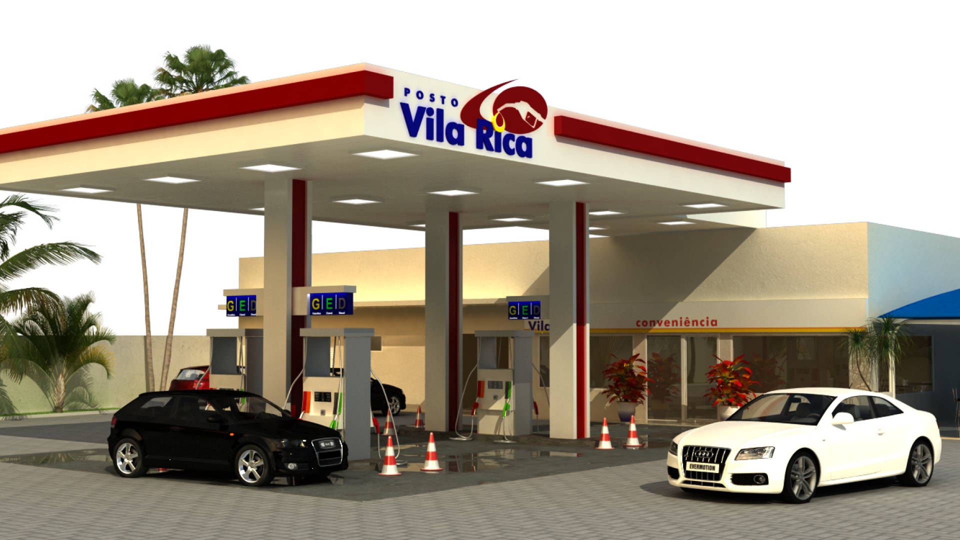
Vila Rica gas station design