IMAGE GAS STATION
CH COMBUSTÍVEIS
OVERVIEW
We proudly present the new gas station visual identity for CH Combustíveis! Located in Paranacity, Paraná, the station sought to renew its image and improve communication with customers. From the very beginning, the owners requested an exclusive project, developed from scratch to meet the specific characteristics of the site. In response to this request, our team began the creative process, analyzing the customer profile and the station’s positioning within the city. Based on these insights, we developed a visual solution that combines modernity, functionality, and strong urban presence.
SERVICES
| STORE FAÇADE | LOGO DESIGN |
| COLUMN CLADDING | PRICE TOTEM |
| PUMP COMMUNICATOR | SIGNBOARD |
PRODUCTION
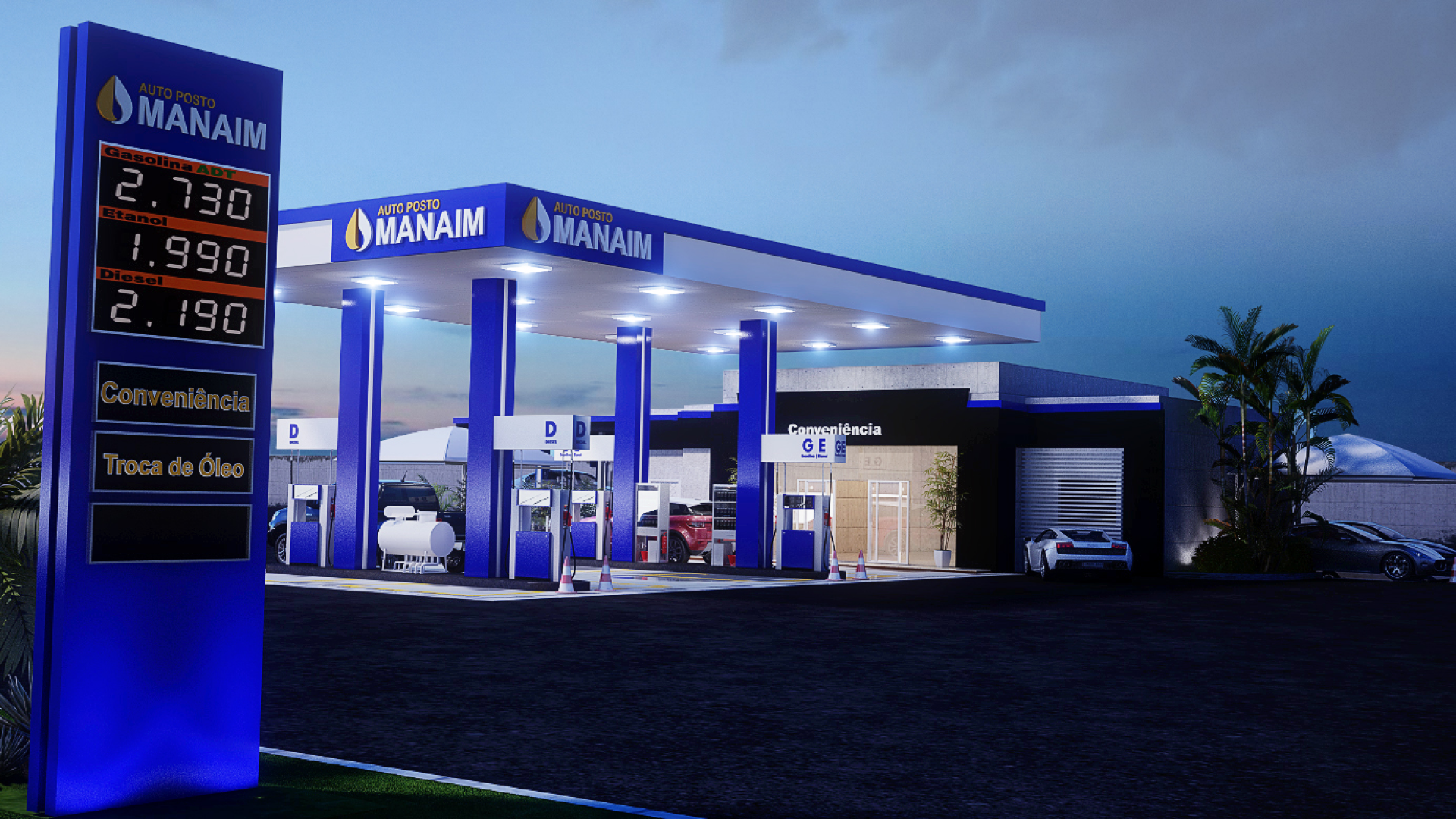
Given the large size of the forecourt and the extensive open space available on the property, our team decided to adopt a more robust and sophisticated visual identity for the CH Combustíveis gas station. From the outset, we aimed to create an impactful image that would enhance the space and convey a strong sense of modernity.
For this reason, we chose to work with more intense and striking colors to strengthen the station’s visual presence within the local landscape. To bring this concept to life, we installed black ACM column claddings. This choice gave the structure an elegant and imposing look.
In addition, to ensure greater functionality and improve communication with customers, we strategically positioned the pump communicators. Instead of using separate structures, we fixed them directly onto the columns. As a result, this solution significantly increased the visibility of information during refueling.
With this combination of visual and functional enhancements, we successfully transformed the forecourt into a more organized and attractive environment. Ultimately, the final result is fully aligned with the new aesthetic standard of CH Combustíveis.

Gas station facade: CH COMBUSTÍVEIS
We developed the new gas station visual identity for CH Combustíveis with a special focus on the canopy design. Our goal was to ensure full integration with the aesthetic standards of the forecourt and, as a result, reinforce the station’s overall brand identity.
To achieve this, we applied ACM panels in black and red along the entire fascia. This solution created a bold and modern contrast. Furthermore, to increase brand visibility, we placed the logo on the sides of the structure. This positioning helps the station stand out within the urban landscape.
In addition to the canopy project, we also redesigned the convenience store facade. We used the same material and maintained the same color scheme as the fascia. Consequently, this created a clear and cohesive visual harmony between the two main architectural elements.
Ultimately, thanks to this combination of well-planned visual solutions, we built a strong, organized, and visually impactful gas station image. This new identity is capable of attracting customers’ attention from their very first approach.
Related Works
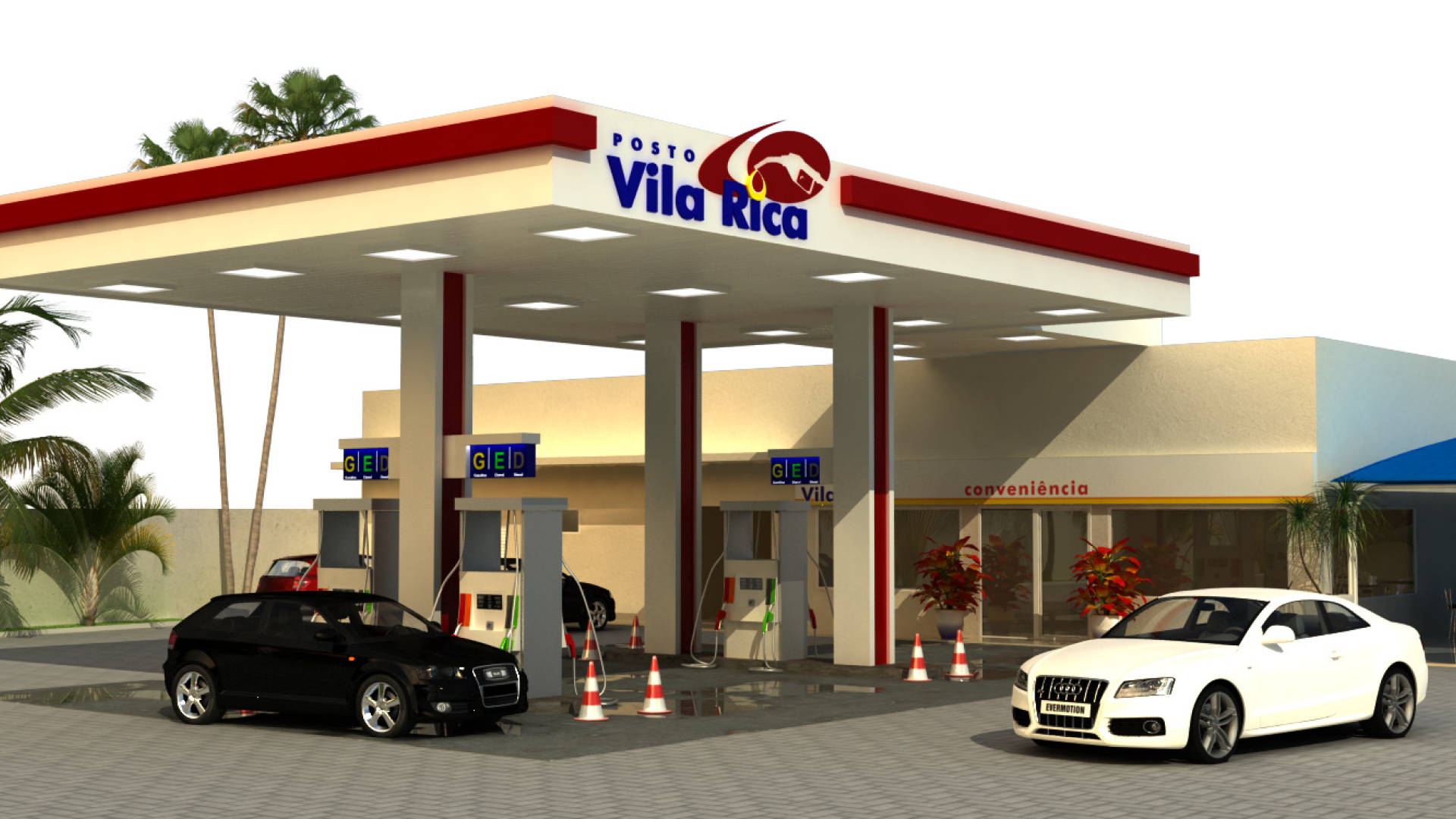
Vila Rica gas station design