GAS STATION IMAGE
SÃO FRANCISCO
OVERVIEW
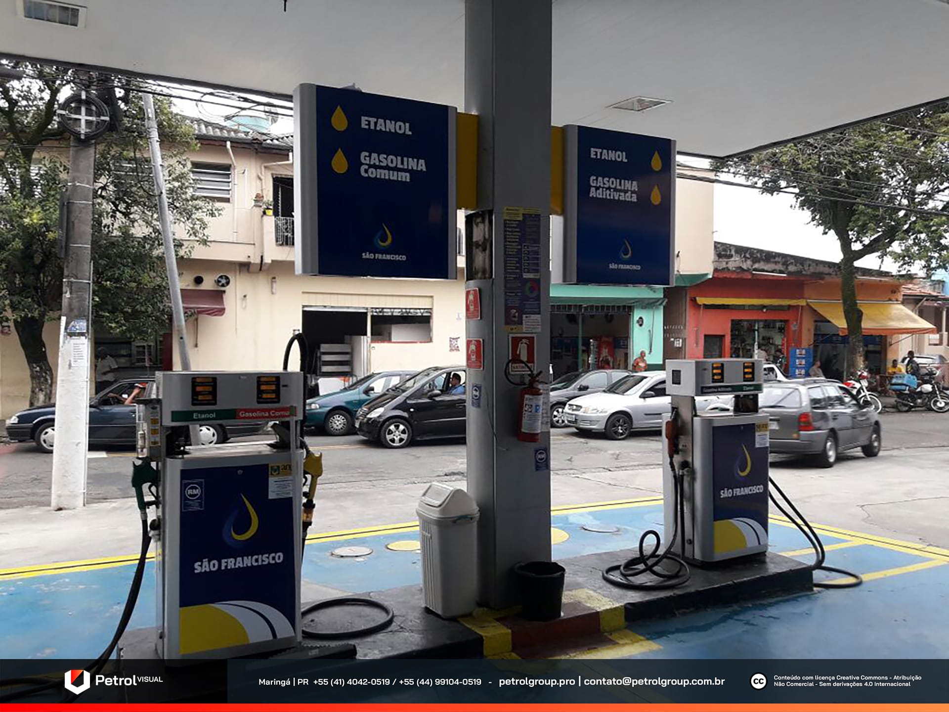
Discover the new image of the São Francisco gas station! Our team completely transformed the visual identity of the São Francisco station, located in Osasco, São Paulo. Positioned in a strategic area with high customer traffic, this unit has always stood out in the region. However, aiming to enhance the fueling experience and make the environment even more attractive, the owner hired us to develop a renewed visual project. From this demand, we created a modern, functional proposal aligned with the latest industry standards. As a result, we were able to enhance the façade, highlight the brand’s identity, and ensure more effective visual communication with customers.
SERVICES
| ACM CANOPY FASCIA | STOREFRONT FAÇADE |
| COLUMN CLADDING | PRICE TOTEM |
| PUMP COMMUNICATOR | SIGNBOARD |
PRODUCTION
In the fueling area, our team created a design that immediately conveys the commitment and reliability of the São Francisco gas station. To achieve this, we carefully selected each material and color. Our goal was to highlight the station’s identity and give customers a memorable visual experience.
First, we clad the columns with gray ACM panels. This material ensures durability and reinforces the modern, professional character of the structure. Then, we designed the pump communicators in a flag-style format. This strategic choice guarantees excellent visibility of information for drivers. Furthermore, we applied the brand’s colors to every element. As a result, the entire set feels cohesive and impactful, standing out within the urban environment.
Ultimately, the new image of the São Francisco gas station communicates organization, trust, and attention to detail. Every aspect was planned to make fueling more practical and visually appealing. At the same time, the project strengthens the brand’s presence and recognition among the public in the region.
Gas Station Façade SÃO FRANCISCO
Since the São Francisco gas station has two separate canopies, our team designed two independent fascia claddings while keeping a consistent visual identity. From the beginning, we focused on ensuring aesthetic unity between the structures. At the same time, we avoided sacrificing functionality or visual impact.
To achieve this goal, we chose ACM as the main material. It offers excellent cost-effectiveness, strong resistance to weather, and a refined finish. On both fascias, we applied blue panels as the predominant base. This choice reinforced the brand’s visual identity. Furthermore, we added yellow and white accents to the side edges of the front face. These details created an elegant contrast that naturally attracts the attention of drivers passing by.
In addition, we installed the company’s logo on both canopies. Each one appears centered, with a bold, raised design. As a result, the logo is easy to see from a distance and from multiple approach angles. In this way, we combined practicality, durability, and brand presence. Ultimately, the solution reinforced the station’s image as a benchmark in quality and professionalism.
Related Works
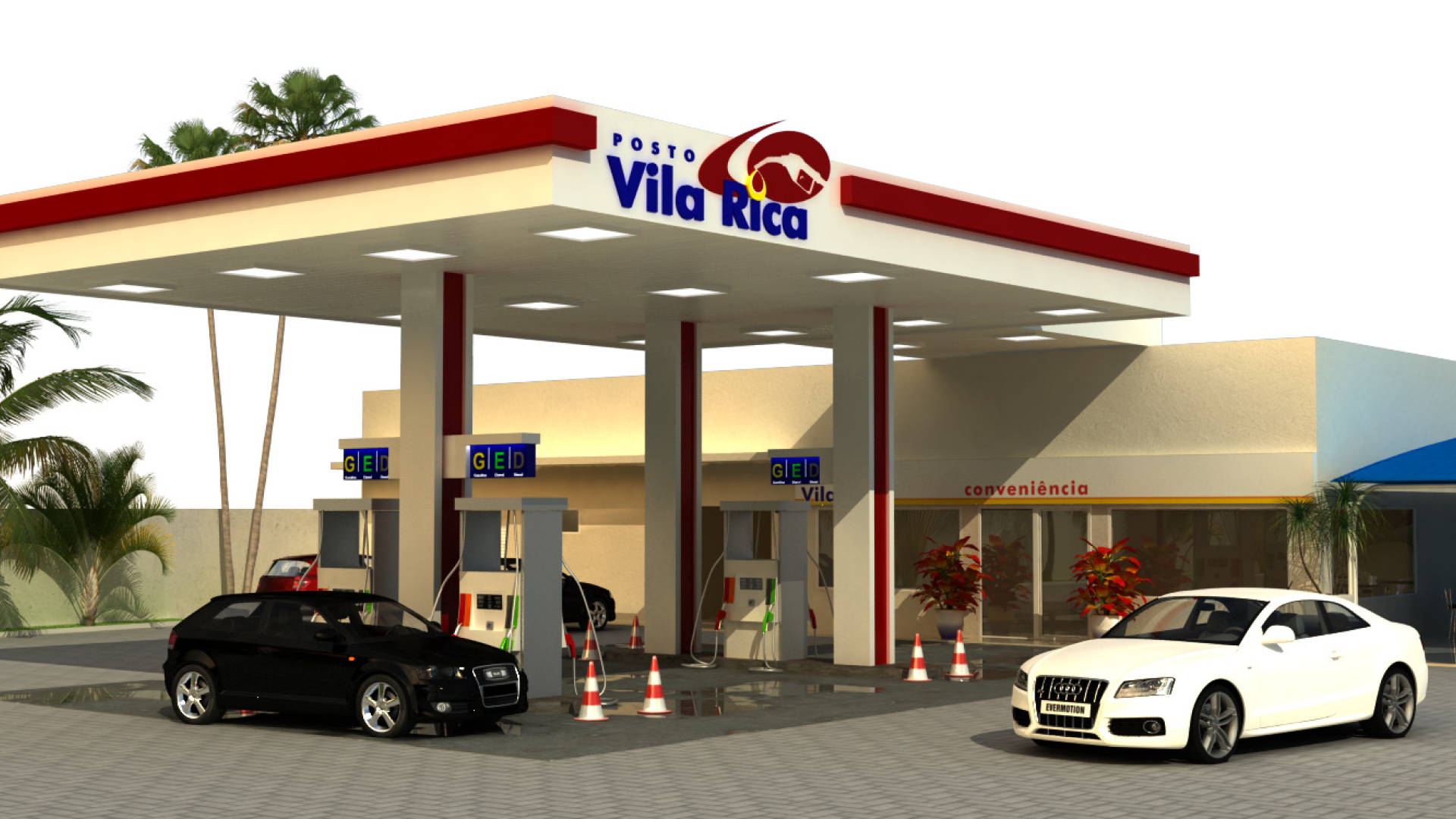
Vila Rica gas station design