GAS STATION RENOVATION
COMPARE
OVERVIEW
Renovation of the Rede Compare gas station, located in the city of Floresta, Pernambuco. Early in the process, the station’s owner reached out to our team with the goal of improving the site’s infrastructure. This allowed us to develop a complete revitalization project, focused on modernizing the structure while also enhancing the fueling experience to make it more comfortable and efficient for customers. As a result, we delivered a visually impactful unit aligned with the standards of the Rede Compare gas station chain.
SERVICES
| ACM CANOPY FASCIA | STOREFRONT FAÇADE |
| COLUMN CLADDING | PRICE TOTEM |
| PUMP COMMUNICATOR | SIGNBOARD |
IMPLEMENTATION

During the renovation of the Rede Compare gas station in Floresta (PE), we enhanced the large fueling forecourt through a carefully planned visual design. From the start, we aligned closely with the owner’s vision. As a result, we delivered a solution that balances functionality, aesthetics, and brand identity.
To achieve this, we first covered all structural columns with white ACM panels. This choice reinforces the perception of cleanliness and modernity throughout the space. Next, we applied custom-coated pump communicators, which created a bold visual contrast with the surrounding elements. Consequently, the fueling area became more attractive, well-organized, and efficient for all drivers visiting the station.
COMPARE Gas Station Façade
As part of the renovation project for the Rede Compare gas station in Floresta (PE), we designed a new façade that quickly became one of the unit’s standout features. From the beginning, our goal was to create a harmonious and well-structured visual composition capable of drawing the attention of anyone passing by.
To achieve this, we built a robust price totem using ACM panels in the brand’s standard colors. At the top, we placed the logo, while the fuel prices were strategically positioned for quick and easy reading. This approach not only improved communication with drivers but also increased the station’s visibility.
Additionally, we redesigned the canopy fascia using the chain’s standard canvas model. The company’s logo was placed prominently at the center, reinforcing the brand identity and ensuring instant recognition for motorists. This design choice enhanced the station’s presence within the urban landscape and elevated its visual standard.
In the end, the renovation successfully combined functionality, visual impact, and brand consistency. These elements were essential in attracting new customers and reinforcing loyalty among those already familiar with Rede Compare’s quality.
Related Works
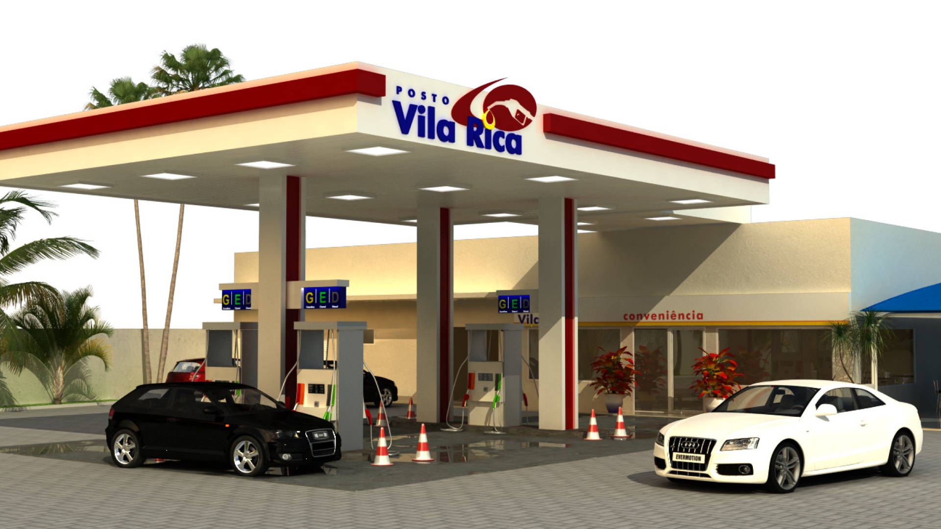
Vila Rica gas station design