GAS STATION VISUAL DESIGN
LUC CHAIN

OVERVIEW
Before any creation of communication and visual identity for gas stations, the Petrol Design team conducts an initial briefing with clients. The purpose of the briefing is to understand the preferences and inclinations of those requesting the project’s creation. With the Aeroporto Gas Station in Santo Antônio de Pádua, Rio de Janeiro, it was no different.
SERVICES
| VISUAL IDENTITY | |
| 3D MOCKUP | |
| LOGO DESIGN | |
| 3D PROJECT |
LOGO DESIGN
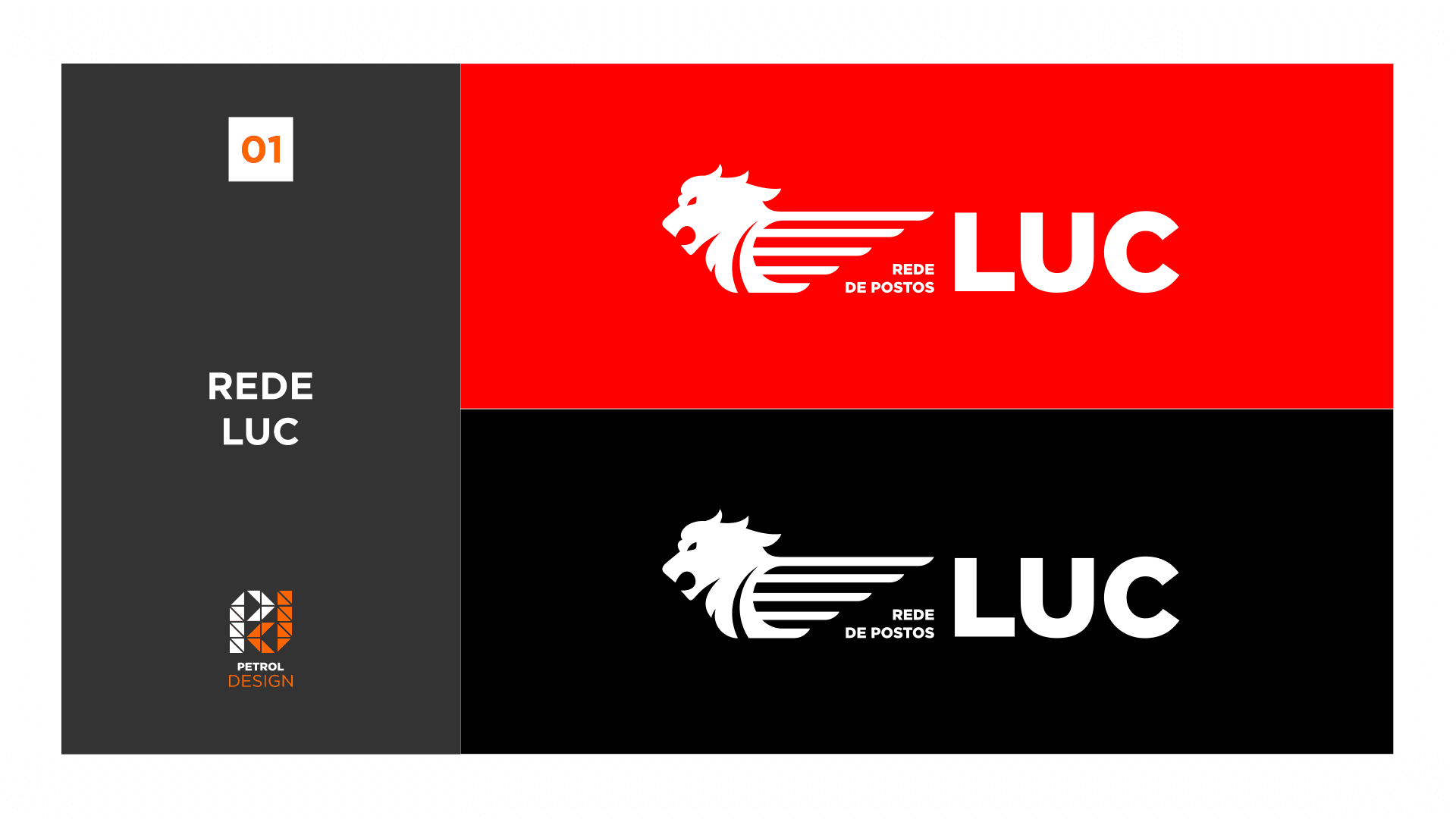
The client provided us with some important information, expressing their desire for a brand that conveys movement, speed, agility, and assertiveness. They also expressed their interest in incorporating the image of a lion in the brand, aiming to evoke a sense of strength to consumers. And thus, the LUC Gas Station Network brand was born, featuring abstract lines of a lion with strokes that convey a sense of motion.

3D VISUAL IDENTITY
These same strokes are incorporated as silver lines in the blue area of the fascia. The columns were covered from bottom to top, extending all the way to the edge of the fascia, concealing a metal structure that supports the canopy. To complete the design, the convenience store stands out with its cladding in red and blue ACM.
Related Works

Vila Rica gas station design
