IMAGE AND VISUAL OF GAS STATION
TORREZAN
OVERVIEW
Image and visual identity of Torrezan gas station! Operating since 1981, Group Torrezan stands out in the sale of fuels, lubricants, and automotive accessories. In addition, it manages a chain of convenience stores that complement its core operations. Now, with the opening of its sixth unit in Paraná, the group identified the need to modernize its brand. Therefore, it invested in a new visual identity aimed at attracting more consumer attention and strengthening its position in the fuel market.
SERVICES
| COLUMN CLADDING | PUMP SIGNAGE |
| PROJECT | PRICE TOTEM |
| STORE FRONTAGE | CANOPY FASCIA IN ACM |
PRODUCTION
Considering both economic feasibility and visual standardization across the network, we developed pump signage with a simpler construction to avoid increased production costs — especially since this project will be replicated in all Group Torrezan units. Moreover, to ensure aesthetic continuity and reinforce the brand’s identity, ACM panels in the station’s colors were applied to the convenience store façade and service doors, such as the oil change area. As a result, we achieved a combination of practicality, cost efficiency, and visual coherence, delivering a functional design with a modern and attractive construction throughout all areas of the establishment.
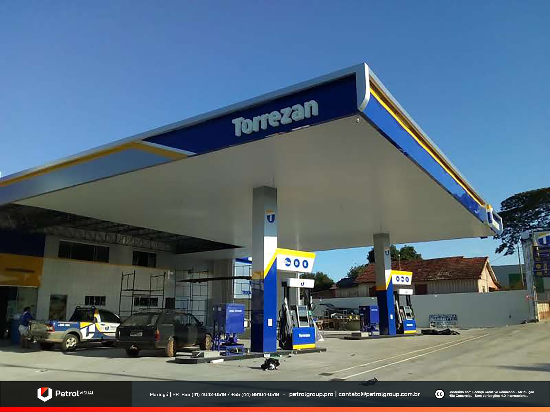
Torrezan Gas Station Frontage
After making small adjustments to the brand, we moved directly to assembling the station’s visual elements. The main goal was to highlight the new identity of the unit. First, we chose blue as the predominant color for the canopy fascia, which was built in ACM. White lighting was added to the logo, ensuring excellent visibility, especially at night. Then, we applied straight-line details along the entire length of the canopy using yellow and silver tones. These accents emphasized modernity, visual contrast, and consistency with the defined color palette.
Since the columns were still new, we opted for a more practical and cost-effective approach by wrapping them in vinyl only. This preserved the original structure while maintaining the color standards defined in the project. As a result, we combined functionality, aesthetics, and resource efficiency at every stage of execution, achieving a harmonious and visually striking final outcome.
Related Works
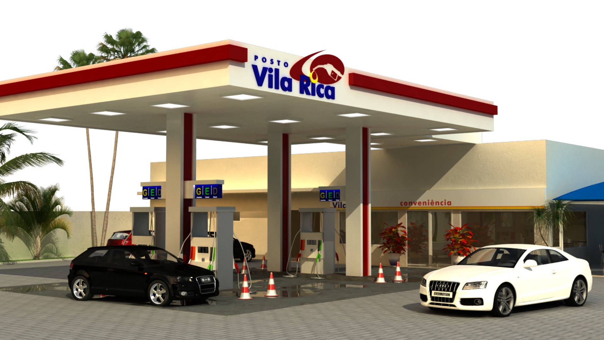
Vila Rica gas station design