IMAGE GAS STATION CHAIN
TAURUS GAS STATION CHAIN
OVERVIEW
Meet the new image of the Taurus gas station chain! With locations across the state of Mato Grosso do Sul, Taurus is a clear example of entrepreneurs committed to innovation and visual excellence. From the very first contact, the owners made their goal clear: to modernize the chain and strengthen its presence in the market. With this objective in mind, we began developing a complete image renewal project. Our focus was on enhancing brand identity while also improving the customer experience. Thanks to a well-structured and compelling proposal, we received immediate approval. We quickly moved into action. The result: each unit has been transformed into a visual and functional landmark in its region.
SERVICES
| STORE FAÇADE | LOGO DESIGN |
| COLUMN CLADDING | PRICE TOTEM |
| PUMP COMMUNICATOR | SIGNBOARD |
PRODUCTION
The Taurus brand already had a well-established color palette. After several meetings with the owners, we decided to maintain these colors to preserve the chain’s consolidated identity. However, we chose to completely renew the visual image of the gas stations. This new concept is more modern and better aligned with the expectations of today’s customers.
As a result, we developed a project that balances innovation with tradition. At the same time, it highlights elements already familiar to consumers. For the fueling areas, we implemented a standardized design to ensure greater uniformity across all locations. This also enhances the brand’s perceived quality.
We clad the columns with wide ACM structures in gray and blue tones. This choice adds elegance and conveys a sense of strength. Furthermore, we installed flag-style pump communicators. These improve readability and facilitate direct communication with drivers, making the fueling process more practical and efficient.
In this way, we transformed both the visual and functional experience of Taurus stations—without losing the brand’s essence.

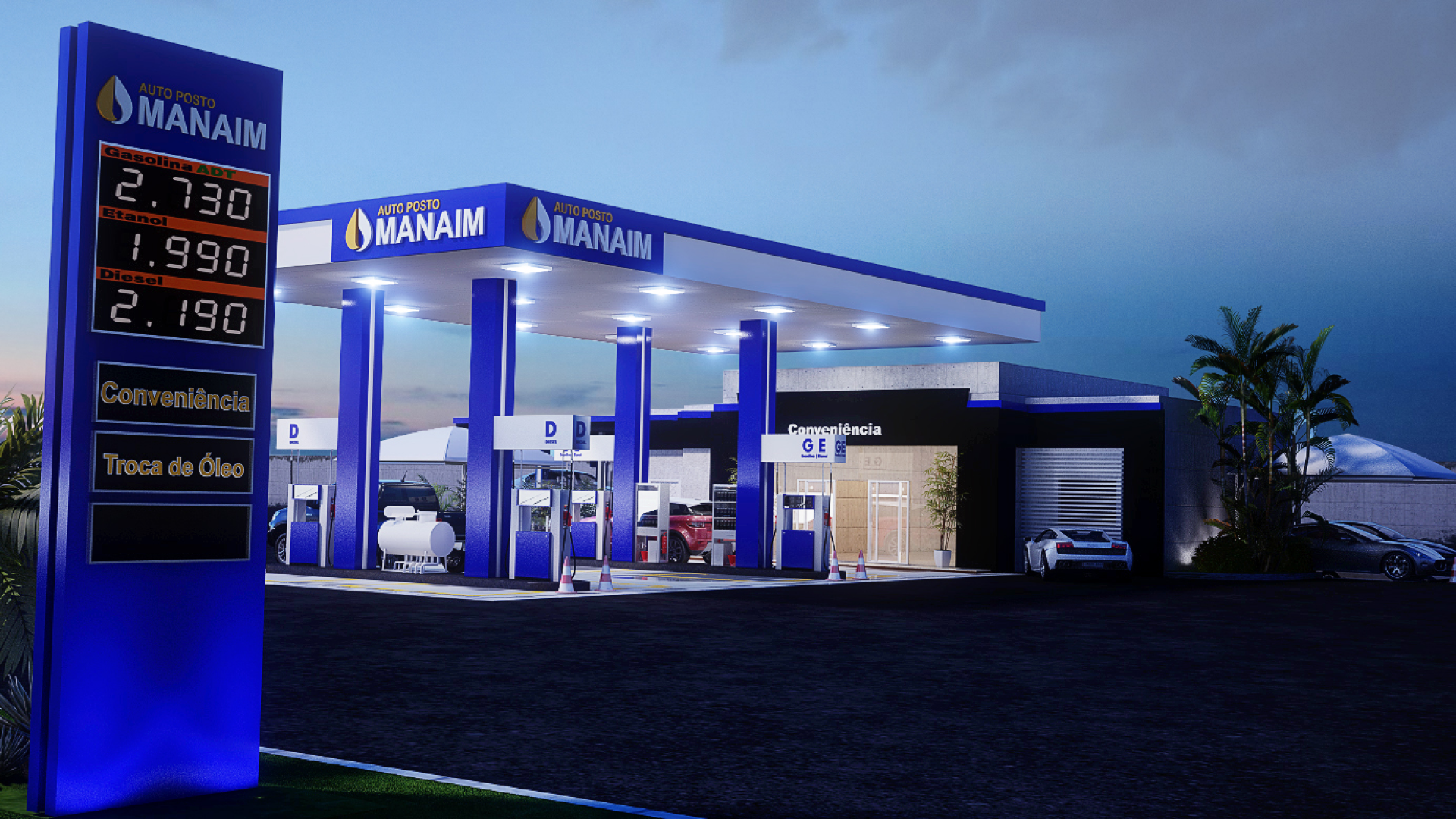
Gas station chain TAURUS façade
The canopy fascia is one of the key visual elements in the new image of the Taurus gas station chain. From the very beginning, we aimed to create a structure that is both bold and functional. Therefore, we built the entire fascia using ACM panels. We chose gray as the base color because it conveys solidity and modernity.
Next, we added the brand’s standard color stripes to create a strong and consistent contrast with the existing identity. To enhance visibility, we placed the logo prominently at the front. We also added the brand mark on both sides of the canopy, ensuring recognition from different angles. This strategy helps reinforce brand awareness, even from a distance—especially important on high-traffic roads.
In addition, we installed price totems at all locations in the chain. These totems feature large LED panels, which ensure excellent readability both during the day and at night. As a result, the visual project successfully combines aesthetics, functionality, and effective communication in a cohesive and appealing design.
Related Works
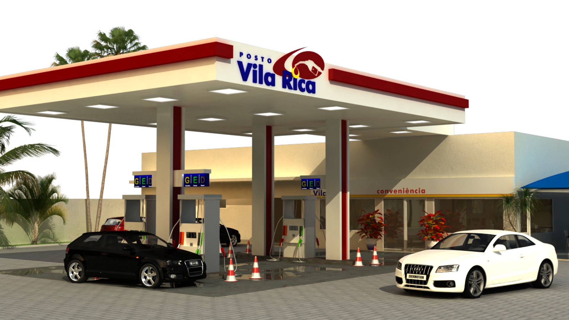
Vila Rica gas station design