INDEPENDENT GAS STATION
CENTRO
OVERVIEW
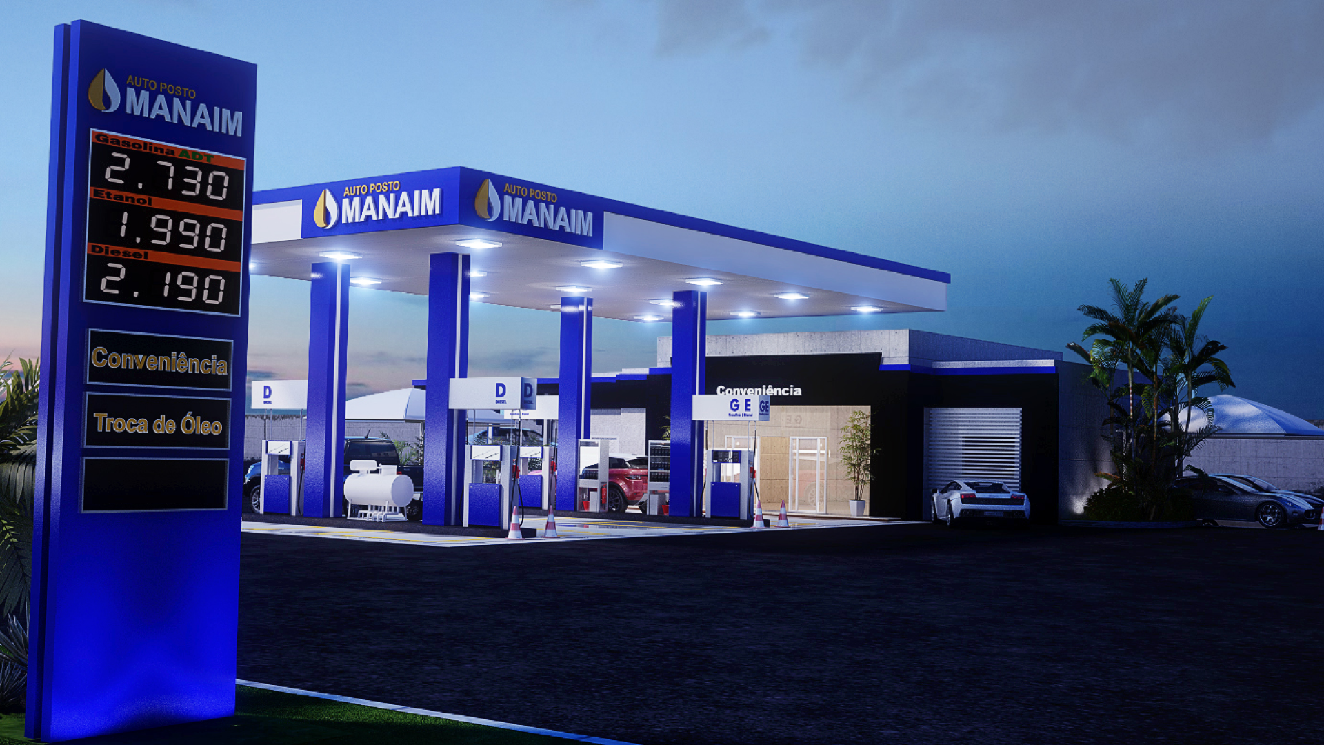
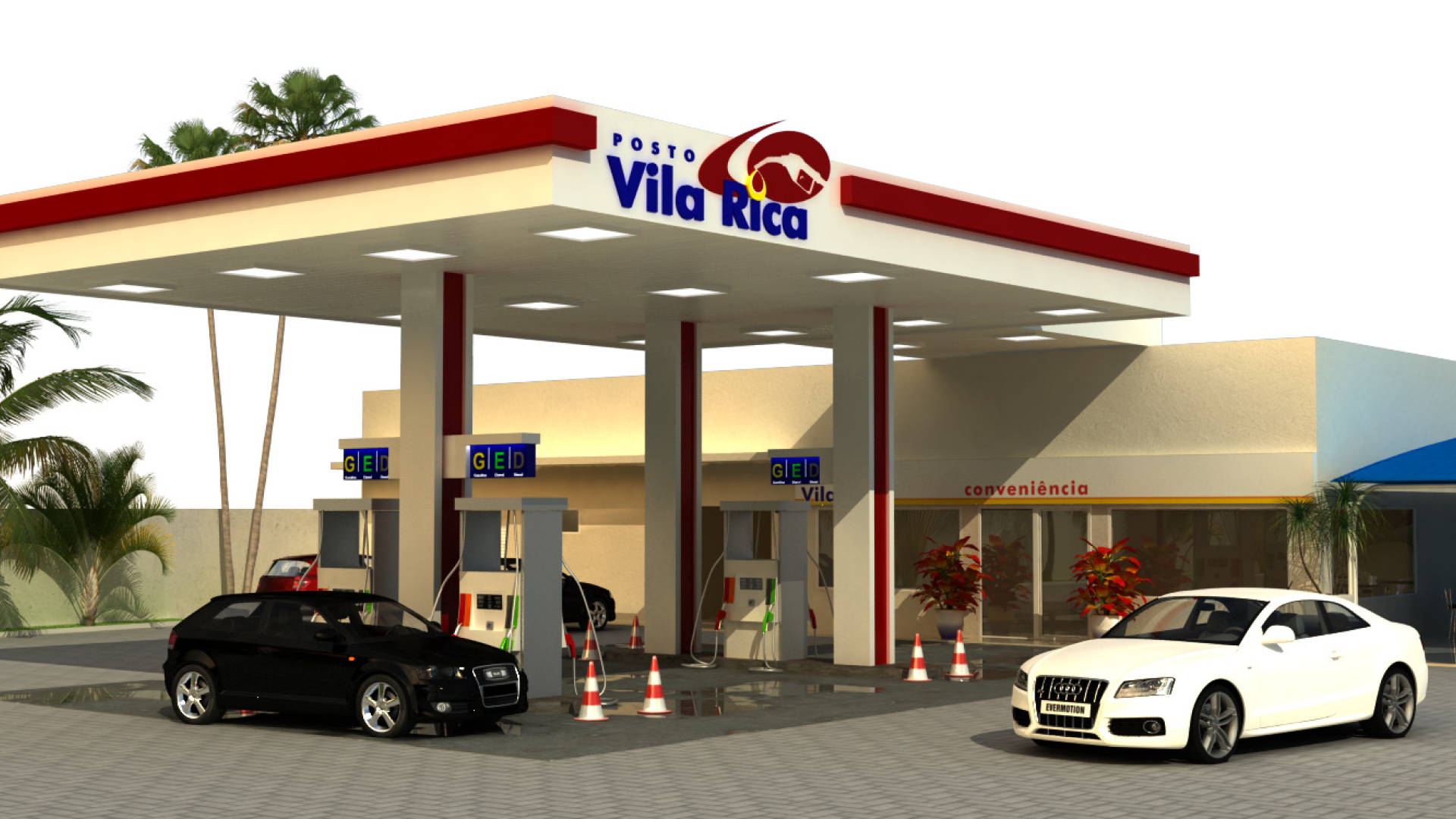
This is another example of how a small gas station requires careful color distribution and a well-crafted visual design project for a grand and refined final result. With a prime location in the city center, the gas station had been abandoned for a long time. After being acquired by new owners, a comprehensive renovation was undertaken to introduce a new concept of an independent gas station to the city’s motorists.
SERVICES
| CONSULTANCY | 3D PROJECT |
| LOGO DESIGN | DESIGN STANDARDS |
| 2D VISUAL IDENTITY | MANUFACTURING |
BRAND
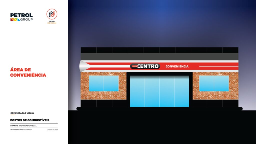
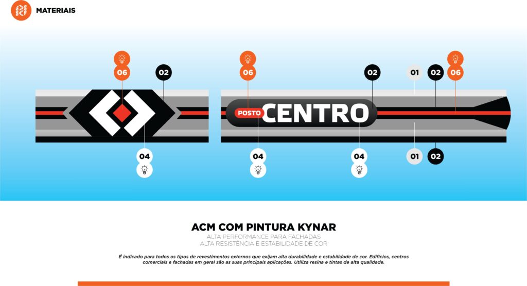
All the elements of this independent gas station were designed with the term “Centro” in mind, starting with the logo. We created a logo featuring two mirrored “C” letters with a dot in the center, conveying the idea of “Centro” three times over.
<h2 data-elementor-setting-key="title" data-pen-placeholder="Digite aqui..." style="font-weight: 500; font-size: 45px; color: rgb(132, 132, 132); font-family: "Bai Jamjuree", sans-serif; text-transform: uppercase;"
2D VISUAL IDENTITY
The central design concept for the visual image of this gas station was a blend of classic and modern elements. We incorporated exposed brick details in the convenience store, black finishes, and a modern industrial aesthetic.
FUEL STATION
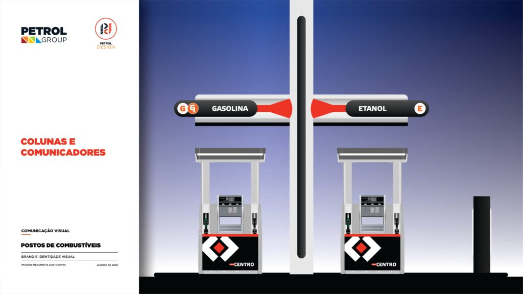
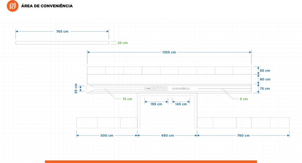
In the canopy, we centered the logo and placed the name of the gas station on both sides, creating symmetry. We also used an illuminated orange strip along the entire length of the canopy, drawing attention to the brand. We designed eye-catching pump communicators and applied a panel to the building to highlight the convenience store. On the side of the gas station, where the deck area would be, we also created another simplified communicative panel to attract customers.
DESIGN STANDARDS
The document is a visual guide that allows for tracking the project’s execution, providing information and specifications about the design, materials, and finishes. It functions as a checklist to compare what was planned with what is being implemented.
Related Works
Vila Rica gas station design