




GAS STATION DESIGN · CUIABA/MT
PANDA
OVERVIEW
The Posto Panda design project creates a striking, accessible and easy-to-recognize brand identity, fully aligned with the lower- and middle-class public. To that end, the proposal uses a strong concept: the direct association with the panda. Thus, the brand gains personality, creates an immediate connection and increases memorability. As a result, the station stands out in the region with clear, modern and attractive communication. In addition, the project prioritizes quick reading and visual impact. In this way, customers easily identify the station, understand the services and recognize the value proposition from the very first contact.
Services
| DESIGN | LOGO |
| DESIGN SPECIFICATIONS | DESIGN KIT |
PROJECT

The Posto Panda design organizes brand identity, operations and service in an integrated way. The layout strategically distributes ethanol, regular gasoline, premium gasoline and diesel (S10 and S500), ensuring flow and efficiency in fueling. In addition, the project takes advantage of the multiple access points and directs the communication toward the main flow on Avenida Perimetral. With this, the station increases visibility and attracts more customers.
At the same time, integrating prices into the price sign speeds up reading and makes the consumer's decision easier right on arrival. Another important point is the presence of complementary services, such as convenience store, pharmacy and oil change. In this way, the station increases consumption, raises the average ticket and strengthens its positioning as a service center.


LOGO
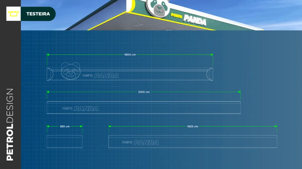
The Posto Panda brand uses the panda as its central element, creating a direct, recognizable and distinctive identity. In addition, the concept combines charisma with brand presence. Thus, the logo works well on the canopy fascia, on the price sign and across all signage.
The color palette follows a strategic line based on the panda universe. Therefore, the project explores combinations that ensure contrast, visibility and harmony. Finally, the typography highlights the name POSTO PANDA with clarity and strength. In this way, customers read and remember the brand easily.

DESIGN SPECIFICATIONS
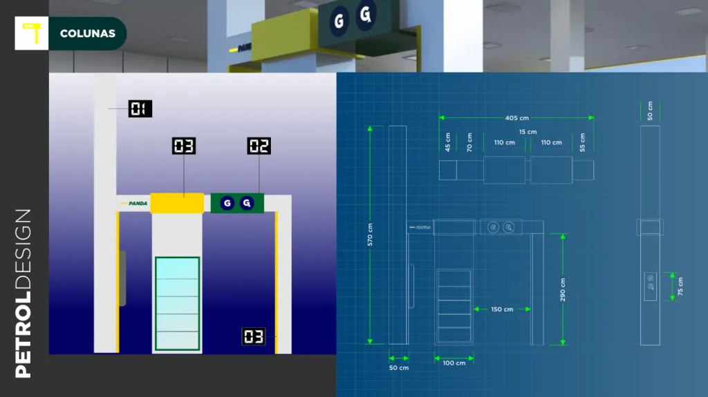
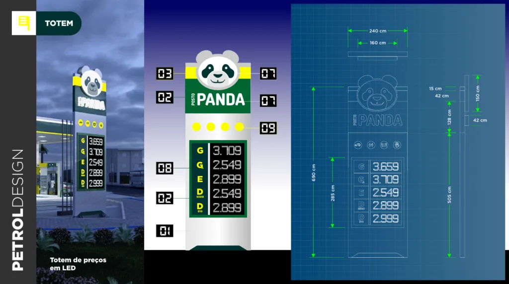
The project organizes the space to ensure efficient, comfortable operation. The distribution of the fuel dispensers reduces conflicts and improves flow. In addition, the layout includes strategic parking, making access to services easier and increasing the customer's dwell time.
PANDA GAS STATION DESIGN
The Posto Panda design works directly on attracting and converting customers. The union of a strong brand identity, functional layout and efficient organization creates a competitive position in the region.
In addition, the integration of services increases profitability and improves the customer experience. Thus, the station is no longer just a fueling point and becomes a complete convenience center.
Finally, Posto Panda establishes itself as a modern, accessible and highly attractive project, ready to grow and stand out in the market with a gas station design and brand identity high-impact one.
Related Works

Pontual gas station design
