VISUAL AND FAÇADE GAS STATION
ABASTECEDORA CARDOZO
OVERVIEW
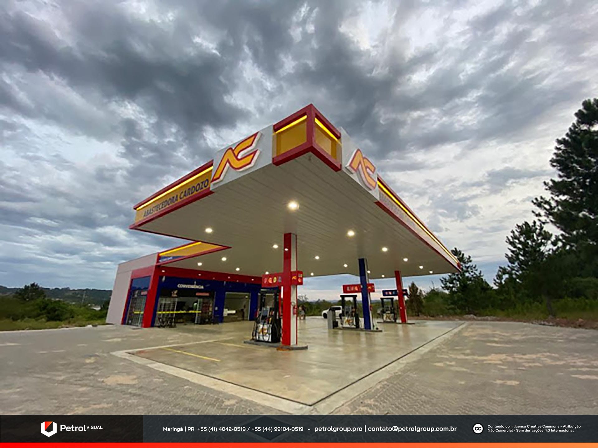
Visual and façade of the Abastecedora Cardozo gas station! From the very beginning, we designed this unit of the Abastecedora Cardozo chain from scratch, located in the city of Parobé, Rio Grande do Sul. To achieve this, the PETROL VISUAL team developed every detail with precision, always focusing on customer satisfaction and service excellence. As a result, we delivered a modern, functional visual project aligned with the chain’s standards, reinforcing its market presence and offering a more attractive and efficient fueling experience.
SERVICES
| ACM CANOPY FASCIA | STOREFRONT FAÇADE |
| COLUMN CLADDING | PRICE TOTEM |
| PUMP COMMUNICATOR | SIGNBOARD |
PRODUCTION
The production of the station’s elements represents one of the most important stages of the gas station visual and façade project, as this is the moment when the establishment’s visual identity takes shape. For this reason, it is essential to prioritize high-quality materials and excellence in service execution. In this case, we built the façade elements using ACM and acrylic, ensuring durability, sophistication, and a flawless finish. In addition, we applied strategically positioned LED strips to highlight the volumes and provide excellent visibility both during the day and at night. As a result, the station gained a modern, striking, and unique visual identity and façade, reinforcing its presence in the urban landscape.

FAÇADE ABASTECEDORA CARDOZO
The fascia was produced in ACM in yellow, red, and blue, combined with strategically installed LED strips to ensure efficient lighting and strong visual impact. This combination made the station highly eye-catching, especially at night. In addition, we designed the support columns following the station’s color scheme, which provided uniformity to the overall look. The pump communicators also followed the same line, reinforcing standardization and contributing to a cohesive, attractive aesthetic. As a result, the final design received numerous compliments from customers. For the convenience store façade, we chose to keep only red and blue, creating a modern layout entirely clad in ACM. This façade integrates harmoniously with the Oil Change sector, reinforcing the project’s visual and functional unity.
Related Works

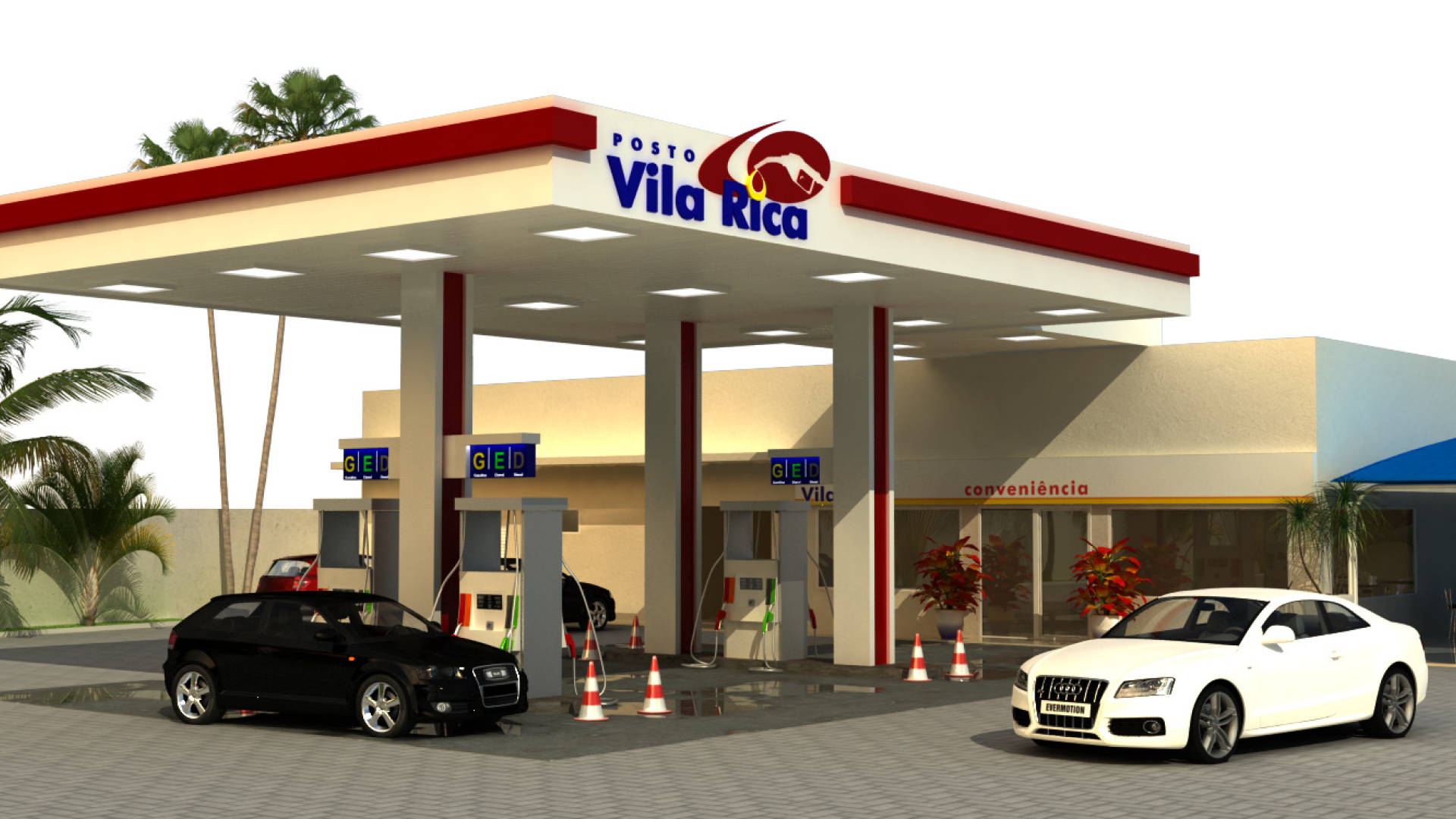
Vila Rica gas station design
