VISUAL GAS STATION
GAS STATION MANAIM
OVERVIEW
The Manaim gas station visual combines efficiency with contemporary aesthetics to meet the needs of a dynamic and diverse audience. Every detail reflects a focus on agility and flexibility, resulting in a cohesive and engaging experience for all visitors. Through an innovative approach, the station conveys elegance and excellence. By integrating cutting-edge design elements, it creates a modern and adaptable environment that stands out as a local landmark. The project embraces a user-centered philosophy, highlighting originality and grandeur as essential values within the community.
SERVICES
| VISUAL IDENTITY | DESIGN |
| LOGO | 3D PROJECT |
PROJECT
The visual identity of the Manaim gas station was designed to be both striking and functional. The canopy features a blue background with white accents, offering an appealing and highly recognizable appearance. To enhance visibility and promote brand recognition, the station’s name appears prominently on both sides of the canopy. In addition, the design team prioritized material efficiency and incorporated natural lighting techniques. These choices not only improved energy efficiency but also supported the project’s sustainability goals. The pump communicator at the front of the station mirrors the canopy’s visual style. Its ACM-clad columns and modern structure ensure consistency throughout the brand’s visual language.
The decision to use ACM in the canopy also reinforces the commitment to durability and long-term performance. Known for its resistance to weather and wear, ACM helps maintain the station’s clean, modern appearance over time. Overall, the visual design of the Manaim station balances aesthetics with function. The result is a practical, eye-catching structure that offers customers a positive and memorable experience.
GAS STATION VISUAL IDENTITY: MANAIM STATION
Related Works
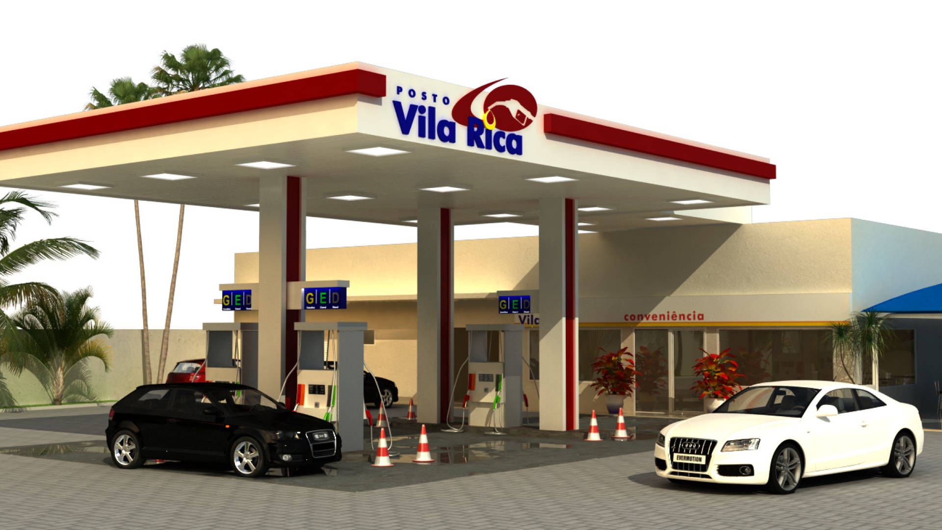
Vila Rica gas station design
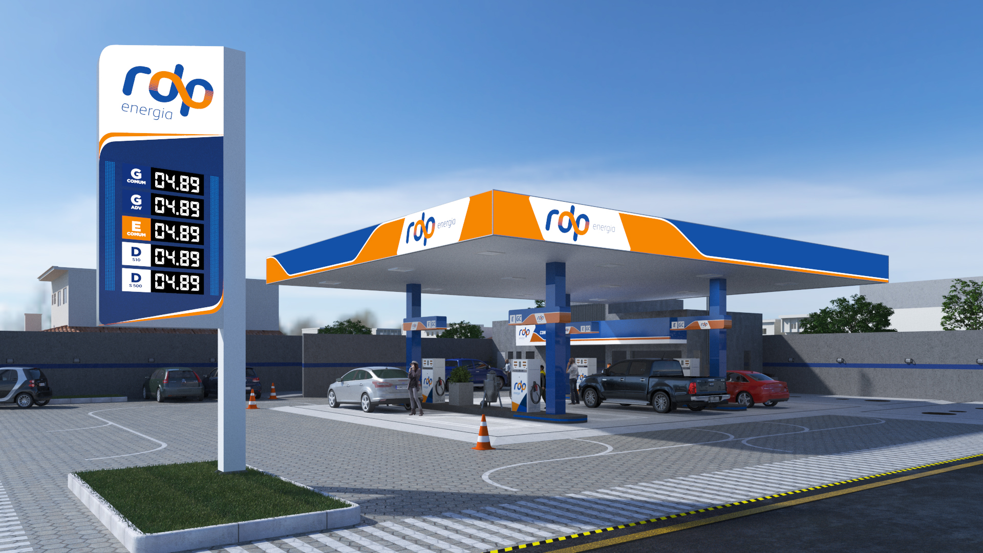
Gas station chain design: RDP (Colombo Unit)
