




GAS STATION BRAND IDENTITY · SAPÉ/PB
AXION
OVERVIEW
Petrol Design conceived the brand identity of the Axion gas station with the goal of transforming the fueling experience through modernity and efficiency. Located in Sapé – PB, the gas station mainly serves the middle-class public and, from the start, breaks with the conventional gas station layout. To that end, the project bets on a futuristic design, a functional structure and a welcoming environment. In addition, the gas station prioritizes convenience, safety and fast service. With this focus, the team planned every detail of the design and the distribution of spaces to optimize the movement of vehicles and people.
Services
| 3D PROJECT | BRAND IDENTITY |
| LOGO | DESIGN |
BRAND IDENTITY PROJECT
Our team dedicated itself fully to creating a clear, coherent and impactful brand identity for the Axion gas station. From the start, we drew inspiration from the theoretical particle “axion,” which symbolizes singularity, advanced technology and the avant-garde. From this reference, we developed a visual concept that conveys dynamism and modernity with elegance.
To do this, we adopted curved, slightly rounded lines, which give fluidity and sophistication to the structure. This choice enhances the feeling of continuous movement while reinforcing the brand’s innovative character.
In addition, we carefully selected the colors purple and silver, which together communicate a futuristic, strong and memorable look. Purple evokes creativity and boldness, while silver suggests technology and precision, creating a striking visual balance.
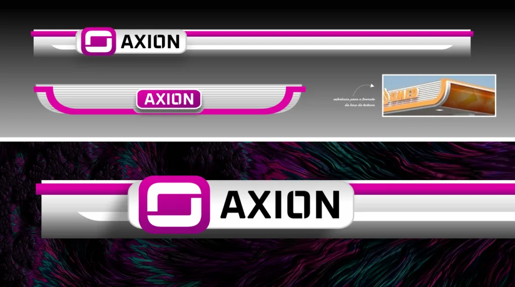
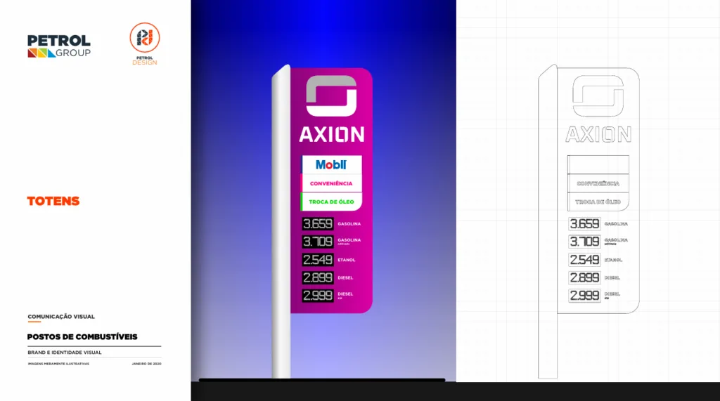
Another essential aspect of the project was the strategic planning of the lighting. Designed to highlight the architectural elements, it ensures visual impact at different times, both day and night. As a result, the gas station keeps its grandeur and presence in any lighting condition.
In this way, the Axion gas station stands out in the urban landscape not only for its distinctive aesthetics but also for representing a new benchmark in modernity and excellence in the fuel segment. Every design decision was guided by the mission of making the brand visually strong, current and able to offer a memorable experience to its customers.
In short, the brand identity of the Axion gas station translates innovation with personality, positioning the brand in a unique and strategic way in the market.
GAS STATION BRAND IDENTITY: AXION
The Axion gas station has a strategic location, on a corner lot with access from two one-way streets, ensuring visibility and easy entry and exit. To keep traffic always moving, the team distributed the fuel dispensers efficiently, avoiding congestion and optimizing movement. In addition, it integrated the fuel prices into the price sign, which makes them easier to read and brings more convenience to customers’ daily routines.
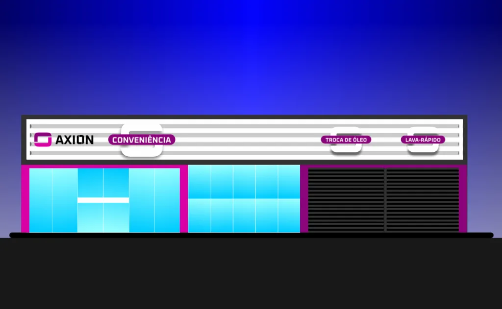
The gas station’s structure balances functionality and comfort. The convenience store offers a modern, welcoming environment, ideal for anyone who wants to take a quick break. Likewise, the team set up an equipped oil change area to ensure safe, fast service. In addition, the administrative office has an organized layout that makes management easier and keeps operations running smoothly. By combining technology, smart design and effective management, the Axion gas station offers a modern, distinctive experience, establishing itself as a new benchmark in design quality and visuals, with a gas station design and brand identity.
Related Works

Pontual gas station design
