




GAS STATION DESIGN · CAXIAS/MA
PRIME
OVERVIEW
The design project for Posto Prime was developed to convey excellence, modernity and trust through a strong, easily recognizable brand identity. Inspired by the concept of superior quality, the project values clean, striking signage, combining shades of blue, white, yellow and graphite to create a sophisticated and highly visible image. As a result, the business stands out in the city of Caxias/MA, strengthening its presence and making it easier for drivers to identify.
Services
| DESIGN | LOGO |
| DESIGN SPECIFICATIONS | DESIGN KIT |
PROJECT
The design of Posto Prime integrates brand identity, functionality and consumer experience into a single concept. The layout strategically distributes the fueling islands for regular gasoline, premium gasoline, ethanol, S10 diesel and S500 diesel, providing efficient operation and better vehicle circulation.
In addition, all the signage was directed to the main facade, facing Avenida Senador Clodomir Cardoso, taking advantage of the region's heaviest vehicle traffic. In this way, the brand is easily recognized even from a distance.
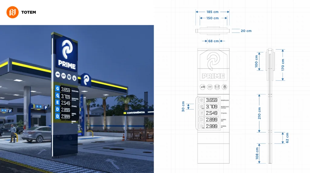
Another highlight of the project is the signage sign developed independently of the price structure. This solution provides greater operational flexibility and reinforces brand presence, while the fuel signage maintains excellent readability for those approaching the station.
The proposal also includes a modern convenience store, exclusive customer parking and LED lighting throughout the canopy, increasing the sense of safety, comfort and value of the business during the day and especially at night.
DESIGN SPECIFICATIONS
The project was developed to serve different consumer profiles, offering an organized and efficient operation. The arrangement of the fuel dispensers reduces conflicts between vehicles and improves flow during peak hours.
In addition, the canopy received ACM signage with LED lighting, enhancing the entire architecture of the station. The convenience store follows a contemporary language, maintaining visual integration with the brand identity and creating a pleasant environment for customers to linger.
The complex also provides for parking areas, easy access to complementary services and the possibility of future expansion of the business.
PACK DESIGN
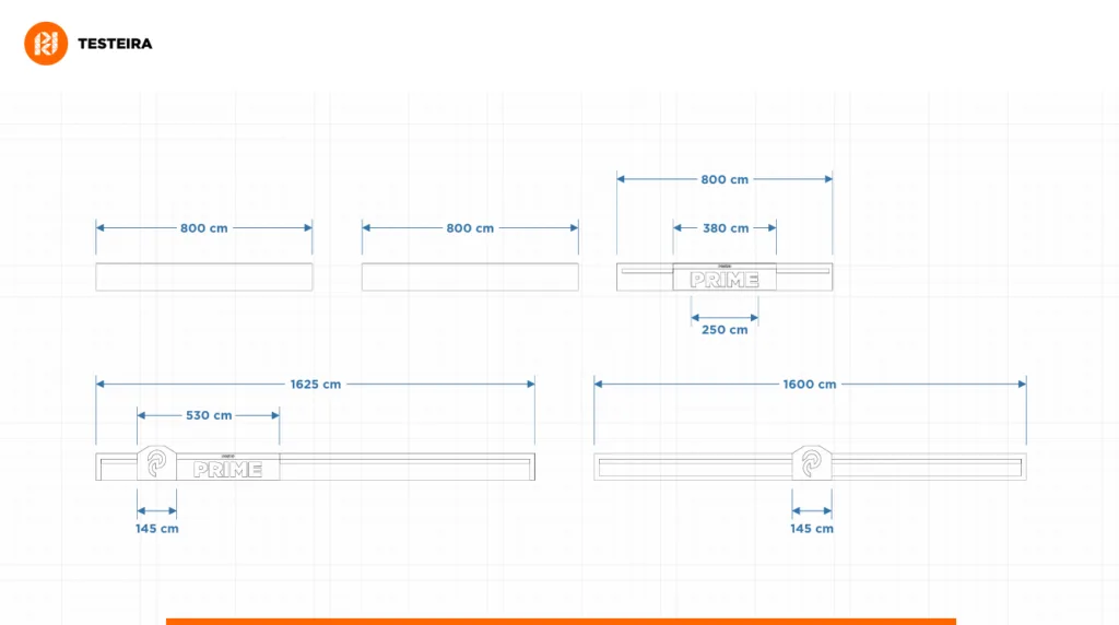
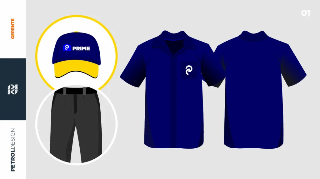
The Posto Prime Pack Design was developed to create a complete, consistent brand identity that is easy to apply at every brand touchpoint. The project brings together the logo, canopy fascia, price sign, signage and architecture in a single concept, ensuring standardization and a strong visual presence.
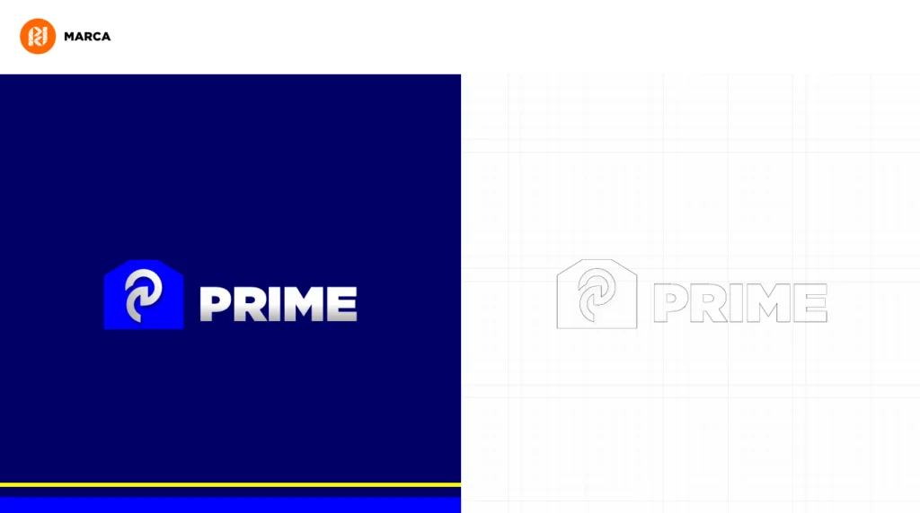
The symbol was created based on the brand's initial, using solid, contemporary shapes that represent movement, trust and excellence. At the same time, the robust typography enhances the name PRIME, providing excellent readability from a distance and reinforcing the business's positioning.
The predominantly blue palette conveys safety, credibility and modernity, while the yellow details create contrast and increase facade visibility. This combination extends to the canopy fascia, the signage pylon, the pump toppers and the other elements of the brand identity, creating a uniform language across the entire station.
GAS STATION DESIGN PRIME
The design of Posto Prime strengthens the brand through a contemporary brand identity, a high-impact facade and strategic communication developed to increase the business's visibility.
In addition, the combination of functional layout, modern architecture, distinctive lighting and visual standardization helps improve the customer experience, convey trust and increase the station's competitive potential.
In this way, the project creates a consistent visual presence at every point of contact with the consumer, positioning Posto Prime as a business ready to grow, win new customers and become a reference in the region.
Related Works

Pontual gas station design
