




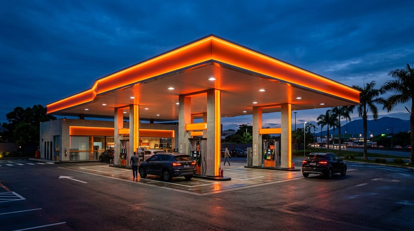
A gas station’s colors are not decoration — they are communication. A driver 300 meters (about 1,000 ft) away recognizes a station by its color before reading any text. That unconscious perception is built over decades of exposure. In Brazil, for example, drivers identify an Ipiranga by its orange and a BR by its green and yellow. Petrol Group analyzes color strategically in every project.
Color psychology in the gas station context
Red: urgency, energy, immediate action — present in many brands. It attracts attention quickly. Yellow/Orange: maximum visibility, accessibility, warmth — the tone most present in the sector. It communicates “stop here.” Blue: trust, technology, cleanliness — less common at traditional gas stations but growing at premium and EV-friendly stations. Green: sustainability, nature — growing at stations with solar power and EV chargers. White: cleanliness, premium, modernity — used at high-end stations as a background color.
How to choose the palette for an unbranded gas station
For stations without a brand, the criteria are: differentiation from competitors in the same area (do not use the same colors as the nearest station), alignment with the target audience (mass-market audiences prefer vibrant red/yellow; upscale audiences prefer more restrained palettes), daytime AND nighttime visibility (test the color with and without lighting), and ease of production in ACM and printing. See an example in the Posto Marinho signage project, in Betim/MG (Brazil), where the palette was reduced to gain visual impact.
Palettes that work for independent gas stations in 2026
Combinations with well-documented visual performance: Deep blue + gold yellow + white (conveys quality + visibility). Dark green + orange + white (sustainability + energy). Black + gold + red (premium, suited to upscale neighborhoods). Royal blue + white + silver (technology, modern).
Frequently asked questions
Can I use colors similar to a major brand?
Using orange or yellow is not prohibited, but marks that are too similar to the major fuel brands create consumer confusion and can expose you to trademark infringement or unfair competition claims. Check with a trademark attorney before you finalize the palette.
See: brand identity for gas stations, logo for gas stations and the Petrol Group design service.