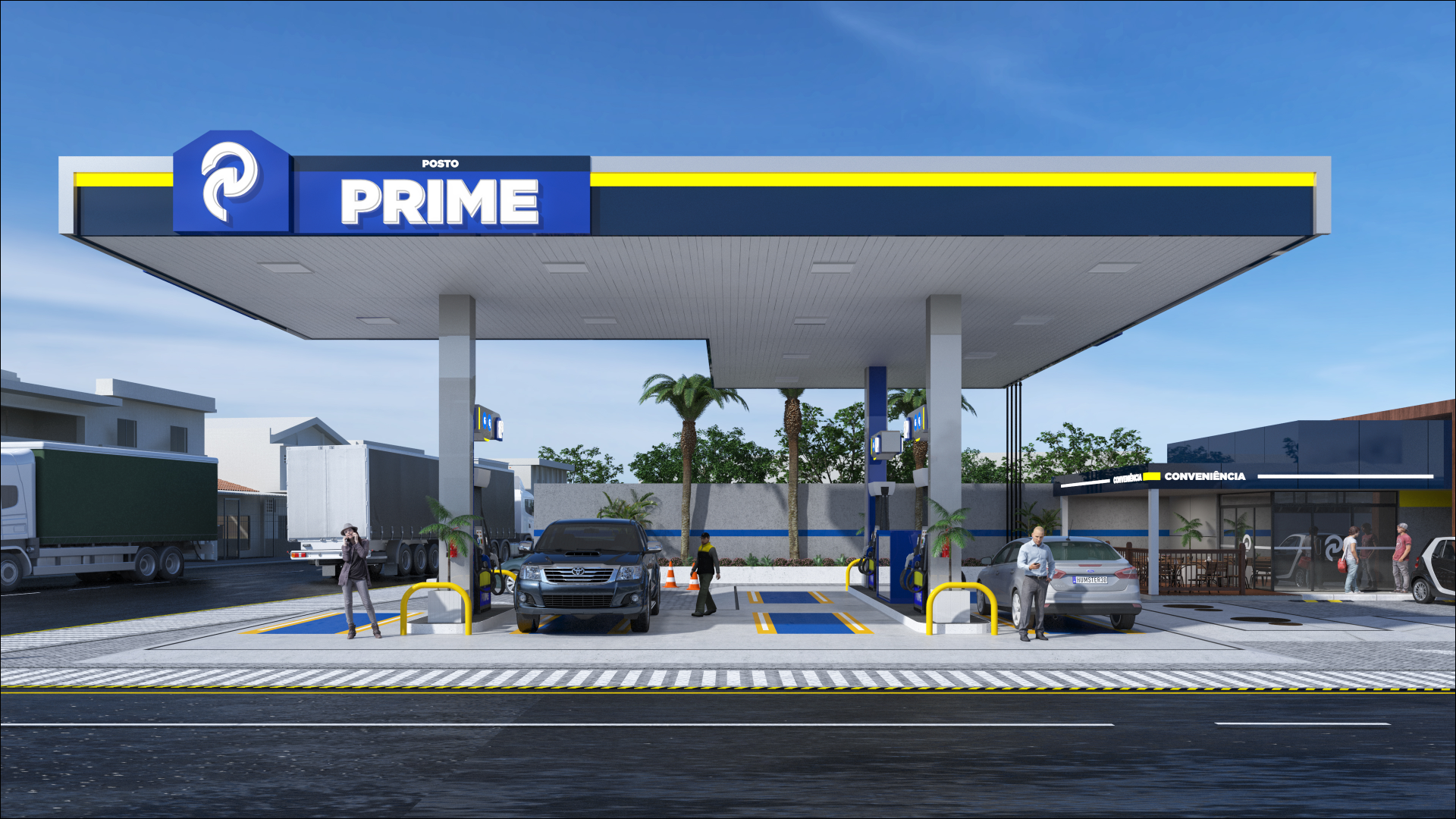


GAS STATION DESIGN · IPORÃ/PR
POSTO CAFÉ

OVERVIEW
Services
| DESIGN | LOGO |
| BRAND IDENTITY | DESIGN SPECIFICATIONS |
BRAND IDENTITY PROJECT
The design of the Café gas station uses royal blue as its main color, conveying a sense of trust and professionalism. Vibrant yellow, as the secondary and highlight color, reinforces brand visibility, while white, as a neutral base, provides contrast, lightness and visual cleanliness. This color set ensures high legibility and creates a significant visual impact, both up close and from a distance.
In addition, we built the station's brand identity with soft, curved shapes and a high-gloss finish, conveying modernity and sophistication. The lighting applied to the canopy outlines highlights the architectural design at night, further reinforcing the brand's presence. The graphic symbol, a stylized yellow flower, is simple, memorable and friendly, working as an easily recognizable icon associated with the station.
We designed the convenience store with glass, giving the space modernity and transparency. The oil change area has its own canopy fascia but follows the same visual standard, keeping the different sections cohesive. We carefully planned the layout of the spaces to ensure smooth service, visibility and customer comfort.
Finally, we worked the typography of the name “Café Auto Posto” in upper- and lowercase letters with rounded strokes, reinforcing the visual proposal of lightness and warmth. We highlighted the word “CONVENIÊNCIA” in a sans-serif font, ensuring excellent legibility and easy reading from a distance, with a gas station design and brand identity.
GAS STATION DESIGN PROJECT: CAFÉ
Related Works
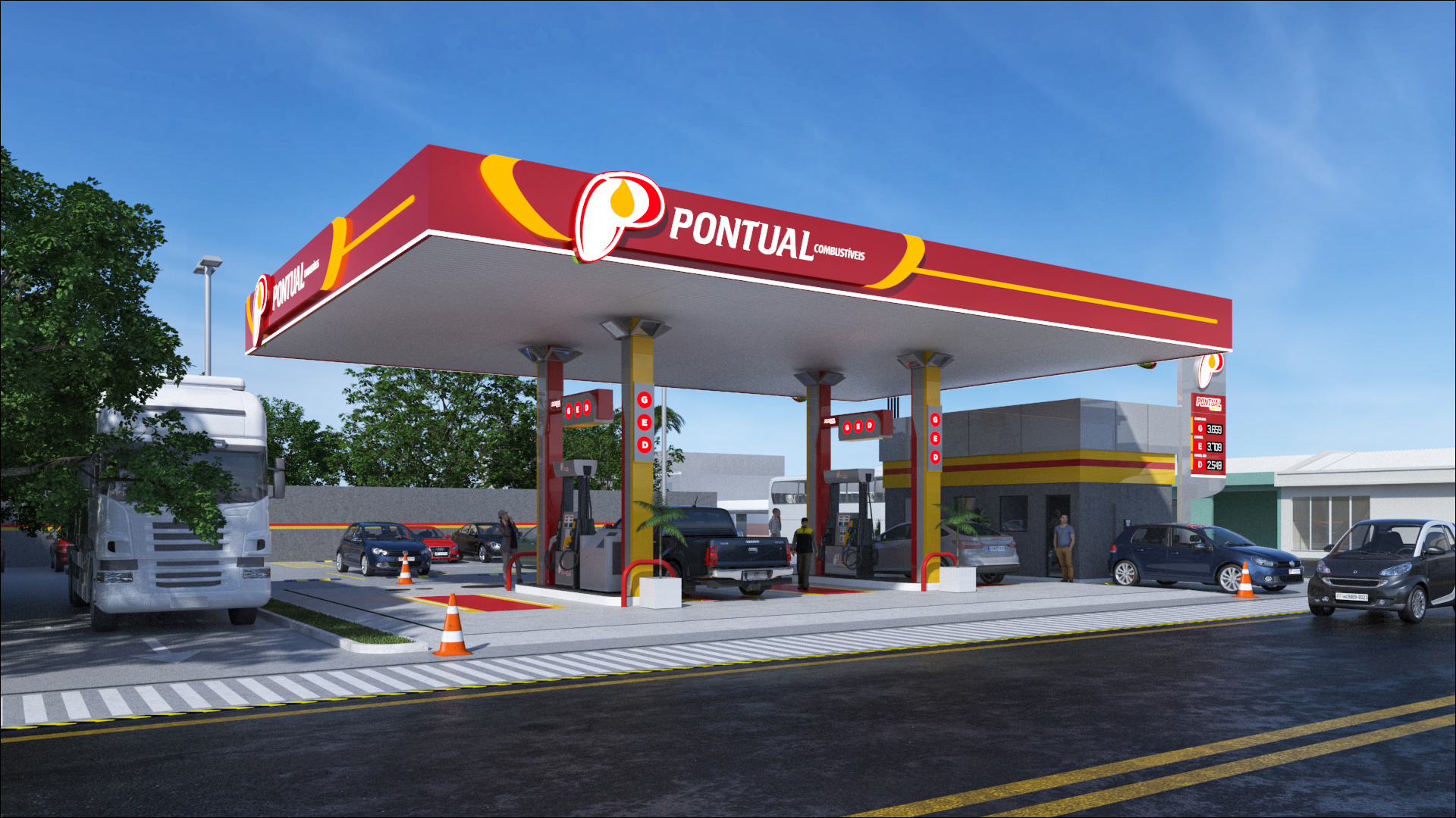
Pontual gas station design